Posted on 07 May 2015
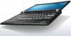
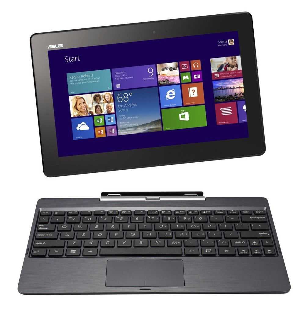
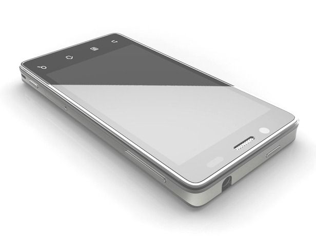
The Lenovo Yoga Tablet 2 10 is a product I’ve been close to buying more than once. I love the stand, the battery capacity, the screen and the design but because it’s ‘just’ a Baytrail-T Atom tablet and I’ve still got the Lenovo Miix 2 10 this just isn’t enough of an upgrade for me. Some of you might be thinking about this as a cheaper alternative to the Surface 3 though so I’m happy to have had Garry Clark, gadget fan and blogger, send me his thoughts. He’s unboxed it, photographed it and written his first impressions for us. Over to you Garry.
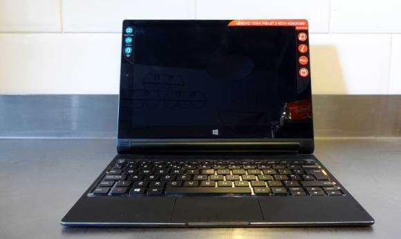
Lenovo Yoga Tablet 2 10 with Windows.
Read the full story

Posted on 28 February 2014
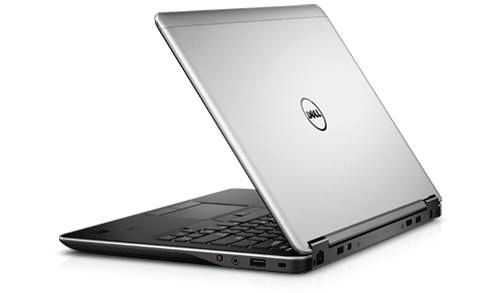
 At first glance, the Dell XPS 11 has it all. It’s sleek, convertible, and has a 2k screen! It’s one of the thinnest and, dare I say, sexiest, Ultrabooks ever released. But will a novel keyboard design be its Achilles’ heel?
Read the full story
Posted on 10 December 2012

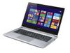
It’s been a busy, but enjoyable weekend with the Lenovo Thinkpad Twist. It fits right into the way I use laptops, the way I like to interact with laptops and the quality I like to see. Is it what YOU want from an laptop though. This Ultrabook Convertible has a great working fascia, extensive set of ports and one of the more popular convertible designs – the rotating screen that not only turns the Twist into a lappable tablet (it’s not a handheld) it also offers some other use cases.
I’ve put together a fairly detailed video overview for you and I think, if you’re considering the Twist, you’ll be able to work out if it’s really one for you. Check it out below.
Read the full story
Posted on 09 December 2012
Since 2006 I’ve owned three swivel-screen laptops and one of them, the Gigabyte Touchnote, became completely ingrained in my mobile computing life. The Lenovo Twist is a similar size and weight but it offers quite a bit more. We’re talking about a useful and desktop-capable Core i5 CPU, 4GB of RAM, a 500GB hybrid HDD and 5-point capacitive touch. This little Ultrabook Convertible is running Windows 8 and also includes a great set of ports. To top it off there’s an IPS display. Out of the box it’s an extremely exciting form factor and it looks and feels both stylish and strong. My first thoughts were ‘I need this Ultrabook.’ After 4 hours of testing I’m still very positive but there are a couple of things that are annoying me.

Read the full story
Posted on 18 September 2012
I get into the user interface in this demo of the Samsung Galaxy Camera from Photokina in Koeln and give you a walk round of the device. I have some sample photos for the next post.
")
Read the full story
Posted on 10 March 2012
Ultrabooknews.com has the Samsung Series 5 for testing. Here’s the unboxing video.
You can find out more about the Samsung Series 5 from previous testing articles and the database. We will be doing a live review of this Ultrabook tomorrow. Details here.

Unboxing and overview, comparison and information on a free software package below.
Read the full story
Posted on 21 December 2011
In July last year Carrrypad was one of the few publications to have unrestricted access to a Moorestown phone. Made by Aava as a reference design it ran Meego. We were supposed to see Intel phones later that year but it turned out that the Moorestown platform wasn’t good enough and Intel promptly moved focus to the Medfield platform. In February this year Intel held an early prototype Medfield phone up on stage. This time it was running Android. Later in the year Meego was effectively dropped and since then Intel have been pushing Android (via an official tie-up with Google) and talking about 32nm Medfield-based phones in the first half of 2011.

Technology Review have had hands-on with an early prototype, possibly another Aava reference design or development kit that Intel are calling ‘production grade.’ They have also had hands-on with a Medfield Tablet running Ice Cream Sandwich too. Unfortunately there aren’t many details or thoughts but there’s a hint that Intel will reveal more at CES in just 3 weeks time. We’ll be in the keynote to cover this of course.
The only real feedback given by Technology Review on the Intel phone was this:
The phone was powerful and pleasing to use, on a par with the latest iPhone and Android handsets. It could play Blu-Ray-quality video and stream it to a TV if desired; Web browsing was smooth and fast. Smith says Intel has built circuits into the Medfield chip specifically to speed up Android apps and Web browsing.
That’s likely to indicate Wi-Di integration and other hardware acceleration. Remember there will be hardware video encoding in Medfield. It’s also likely that Medfield phones scale up a little bit higher than other leading smartphones in terms of performance. What you get in performance though, is likely to cost in terms of battery life.
At the end of the day, if Medfield is good enough, easy to design and integrate and, importantly, cheap enough, manufacturers are likely to be interested. If it offers unique features such as Wireless Display and other technologies, it might even raise an eyebrow with the customer but it’s still going to have to compete in a fierce smartphone market where it will have to differentiate itself against Android and other popular brands, operating systems and platforms.
Via Slashgear
Source: Technoloy Review
Posted on 19 December 2011
")
From the day that the Acer Aspire S3 was launched everyone knew that it would be coming in as a ‘value’ option in the Ultrabook field. We’ve tested it extensively over the last week and can say that it’s not only a ‘value’ option offering Core i5 performance where others in the price category are only offering capped Core i3, but it’s also an honest Ultrabook too. It doesn’t show-off, doesn’t have any outstanding features but it does everything well. From screen to keyboard to performance and battery life it works well as an all-round 1.3KG 13” Ultrabook. Read on for our full review of the Acer Aspire S3 320GB HDD, Core i5 Ultrabook. (Model MS2346 with Finnish keyboard layout being tested here.)
Read the full story


")


")