As Chippy pointed at his personal blog, it’s possible to search Flickr for pictures taken by particular cameras. By analyzing EXIF data, flickr is able to keep detailed data for all the cameras that are used for snapping photos that end up on the site. Flickr has a neat page that has stats for all of their photos and the cameras that they were taken with.
Looking at the stats for iPhones shows some interesting trends:
 *For clarity’s sake, I’ll refer to the iPhone 3GS as the iPhone 3G[S] so that it won’t be confused with the plural of the iPhone 3G (iPhone 3Gs)
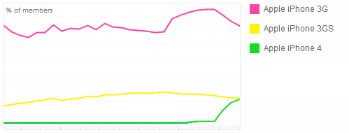
This isn’t the most detailed graph, but I think we can make some educated guesses about what’s going on here.
You can see that the iPhone 3G is the most used camera out of these three, and in fact, you may find it interesting to note that it’s the most popular of all cameras used on flickr (see: http://www.flickr.com/cameras/, this is probably due to a combination of the iPhone 3G’s popularity and the fact that there is a Flickr app in the app store. Traditional cameras naturally can’t upload without going through a computer).
You might also wonder why the iPhone 3G appears to be so much more popular than the more recently released iPhone 3G[S]. I think this has a lot to do with the AT&T contract. Lots of people went out to buy the iPhone 3G because it was much more affordable than the original iPhone and had improved features. Many of these people signed up for new, or re-upped, a two-year contract. When the iPhone 3G[S] was released about a year later, most people weren’t eligible for upgrade pricing.
Now you’ll see the correlation between the dip at the end of the iPhone 3G line and the peak at the end of the iPhone 4 line. iPhone 3G users who purchased the iPhone 3G when it was released are now eligible for upgrade pricing on the iPhone 4. And if we’re looking at this correctly, it looks like people are upgrading from the iPhone 3G to the iPhone 4 at a very regular rate. The iPhone 4 line also shows us something about the availability of the device. You’ll notice that there is only a slight upward trend as the iPhone 4 line lifts off the x-axis, then it suddenly starts to jump upward. This could represent the initial release of pre-order devices, then the availability of new stock.
So what about the iPhone 3G[S]? What’s with that lazy curve it’s got going on? It’s hard to say exactly as the graph doesn’t have a proper timeline, but the dropping end of the line may be cause by Gizmodo’s early iPhone 4 reveal. They got their hands on the iPhone 4 hardware far before the phone was released, and the ensuing drama was covered by major news outlets across the US and even further. People knew in advance that the iPhone 4 was coming and this likely hurt the sales of the iPhone 3G[S].
I’ll be interested to continue watching these charts. If the iPhone 4 and iPhone 3G lines ever cross, I think it’ll be pretty conclusive that lots of people are upgrading.
Agree with me? Have a better analysis? Feel free to let us know in the comments!


