Several of the latest mobile operating systems have interfaces that are based on a very bothersome paradigm: the widget-oriented home screen. I really wish the people making the high level design/UI choices could step away from this awful interface concept and think outside the box to some degree (maybe look into what the First Else is doing?). Now, I’m not an interface designer, but I am someone who has used plenty of these devices and at very least, I can tell you why I hate widget-based home screens on mobile operating systems.
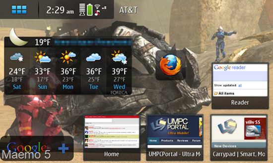
First, the players. The big two at the moment are Android and Maemo (there are also several Windows Mobile shells that suport widgets). Additionally, you may have recently seen the WePad [product page] interface demo, which has a widgetized home screen so large that you need a map to navigate it (literally!). All of these essentially use a multi-“desktop inch design which allows the user to customize what widgets are on each desktop as they pan from one to the next.
 A widget is sort of like a tiny application which resides permanently on the home screen. It usually does a simple task, and generally offers little to no further functionality. When you think of the term ‘widget’ what comes to mind, exactly? I’ll tell you what comes to my mind… “shallow inch.
What exactly do I mean by shallow? Well it’s just that: widgets do something extraordinarily simple. The thing that makes them shallow is that they offer such little functionality that they are practically worthless and become nothing more than a waste of CPU cycles. Generally they do something that could easily be recreated in the status bar. Take, for example, a clock widget. What does it do? It tells the time, perhaps in analog. Is that really useful to anyone? I doubt I’d even waste the space on my screen with an analog clock widget. Is the current time not already displayed in the status bar? How about a widget that shows some recent emails? Generally, the screen is so tight on space that you can only see, perhaps, the last 3 emails that you’ve received, and more often then not, the widget doesn’t sync up with your actual mail application (to mark mail as read, or delete it, etcetera), and then it becomes rather pointless.
Don’t even get me started on the cliché “slideshow inch widget. Is anyone seriously flipping through their multiple desktops to find the slideshow widget so that they can enjoy some random images at 100×100 pixels?
 Even homepage shortcuts, as widgets, can become pointless because of the multi-desktop approach. Should I seriously spend my time swiping through four or five different homes screen desktops to find the shortcut I placed? Wouldn’t it be easier and faster to have the web browser accessible at all times from the push of a button, then just pull up a list of bookmarks?
 Motorola’s “Motoblur inch interface manages to show just one Facebook status update, five words from a tweet, and four words from an email — all on a spacious 480×320 screen. Pathetic.
Even if some widgets do link into a deeper application and stay correctly in sync with them, the widget becomes pointless if the user wants to use a different application. Consider an RSS widget that displays a few posts from an RSS feed. Maybe it can launch out to a built-in RSS reader, but then the user is limited to using the built-in application because it is the only one that supports the widget, even if there is a better alternative application.
Mobile applications, which are already confined to small screens and slow (compared to x86) processing power, are already giving users a stripped down experience. What I’m trying to say is that mobile applications are already much like widgets themselves. They provide the essential functionality. Home screen widgets really don’t have a place anywhere on a mobile operating system. They are so simple that, more often then not, they are pointless. They frequently don’t provide any deeper functionality, and when they do, they only link in to one application, which limits the user from using other applications.
Many people laud widgets for providing “at-a-glance inch info, which I don’t have a problem with, but that sort of information is what the status bar is designed for. One glance at a status bar could easily inform you of the time, battery life, new email, missed call, new text, new RSS items, etc., so why are users expected to waste screen space and device resources to have persistently running widgets? With a smart notification system, applications can call attention to themselves and alert that user that something is up (for instance, a new email has a arrived.) The user should be able to launch into the application just by tapping the notification, and do whatever it is that they need to do from the “full inch interface of the application. The widget middle-man is entirely unnecessary.
 Maybe my issue is simply the fact that widgets are so inconsistent. For the most part they are oddly shaped and they all work differently. If someone created a more inclusive widget, that did more than one random function, it might not be so bad. In fact, on the iPhone I use a bit of software called LockInfo (jailbreak only) which replaces the lock screen with what is essentially a glorified notification list, and I greatly prefer it over a bunch of widgets that are spread across multiple desktops. The great part about it is that we aren’t talking about a Facebook widget that shows one status update, we are actually getting a list of notifications that are directly generated from the Facebook application itself. So clicking on an application takes me straight there and I don’t deal with any widget middle-man. This is beneficial because if I want to use an alternative Facebook application, that application can generate its own notifications to go to the lock screen list, rather than being unable to link in to a proprietary Facebook widget. The concept here is a bit different from widgets, but I still have all of the at-a-glance info that I need right from this screen.
Please let me know in comments… am I the only one that hates widgets on mobile operating systems?