
Media Suite

HP has conjured up a neat, Front Row-esque, media suite. The problem however, is it doesn’t seem to realize that it is on a netbook with a 10″ screen. While this ‘media-center’ style interface might work great for Apple TV, or Windows Media Center through a media center extender (like the Xbox 360), it isn’t as ergonomic on a 10″ netbook. The suite looks impressively polished, and is probably the smoothest application on the computer. However, it feels like it wants to be controlled with a remote, and displayed on a TV. This is most obvious when rolling your mouse over menu options doesn’t even highlight the choice, but using the arrow keys to navigate seems much more friendly. There is a very strange disconnect between the navigation in terms of arrow keys and keyboard usage. As I mentioned, it seems (graphically at least) to favor arrow-key navigation. You see a nicely animated box highlight choices as you move around with the arrow keys; pressing enter will take you into the item you selected. However, to go back up a level, you need to use the mouse to hit a back button. This doesn’t seem to make much sense and definitely doesn’t help the interface flow, instead you find un-intuitive road-blocks and have to stop and think about what you actually need to do to get to where you want to go. There is also a way to leave the media suite without fully closing it and go back to the home screen, but it doesn’t show up in the list of currently running applications, which means it is running in the background without the users knowledge.
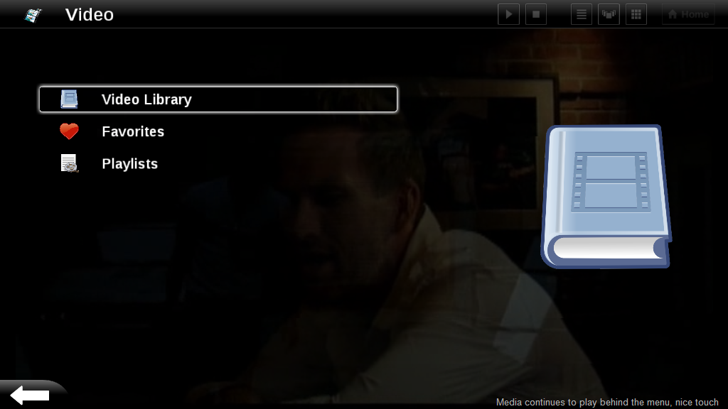
While I have to give HP props for this (graphically) polished app, I think they need to double check their UI decisions. I’ve been playing with it a bit and I still don’t completely get it. There are several interface inconsistencies of vital navigational components which don’t allow the user to flow very well through the program. Sometimes the back button is at the top left of the page, sometimes it is shaped differently and is at the bottom left. The “Home” button, seems like it should take you back to the top level of the interface (pictured above [right]) which let’s you select between photos, video, music or settings, but instead it actually exits the program (taking you back to the ‘home’ screen of the computer). There are several visual sorting option buttons at the top right of the screen, next to the home button, which always look grayed-out, and it is never clear when they can actually be used. All of this will probably make the media suite rather confusing to target Mini 1000 MIE users and they won’t use it, which is sad because it really has some potential.
(Continue reading on page 3…)

Long term software impressions — HP Mini 1000 MIE http://www.umpcportal.com/?p=5895
[reading] Long term software impressions — HP Mini 1000 MIE | UMPCPortal – The Mobile Internet and Comp.. http://tinyurl.com/djr6l6
Long term software impressions — HP Mini 1000 MIE: It has definitely been an interesting testing experience with.. http://tinyurl.com/c7v3kj
The media experience was probably lifted from their work on TVs – which is why it seems so much like a TV.