 I liked the ‘landscape Blackberry’ format of this little messenger I saw at the ARM showcase in Taiwan last week. It’s running Maemo on a Marvell 300-series platform (ARMv5 in the same league as the Nokia N810 in terms of processing power) The screen was a little small for my eyes but I think there’s potential for using this purely for mobile social networking where you need a wide range of services, 3G, GPS and a quality browser to support all the links that get passed about. You’d certainly save battery life on your main phone although there’s an argument that says it would be easier to just go out and buy a cheap Android slider smartphone. The LG GW620 for example. The built quality was impressive although the keyboard would have been better. Unfortunately I don’t have any information about where or when this device will be available and how much it will cost.

Tag Archive | "maemo"

ZTE iBrowser Video
Posted on 09 June 2010
Why I Hate Widget Based Home Screens on Mobile Operating Systems
Posted on 17 April 2010
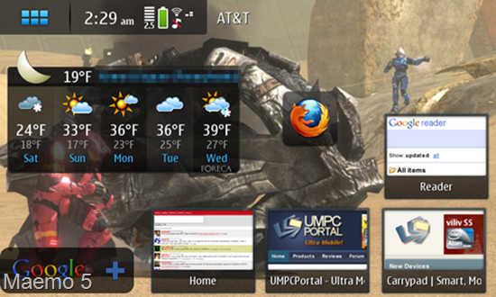
Several of the latest mobile operating systems have interfaces that are based on a very bothersome paradigm: the widget-oriented home screen. I really wish the people making the high level design/UI choices could step away from this awful interface concept and think outside the box to some degree (maybe look into what the First Else is doing?). Now, I’m not an interface designer, but I am someone who has used plenty of these devices and at very least, I can tell you why I hate widget-based home screens on mobile operating systems.
First, the players. The big two at the moment are Android and Maemo (there are also several Windows Mobile shells that suport widgets). Additionally, you may have recently seen the WePad [product page] interface demo, which has a widgetized home screen so large that you need a map to navigate it (literally!). All of these essentially use a multi-“desktop inch design which allows the user to customize what widgets are on each desktop as they pan from one to the next.
 A widget is sort of like a tiny application which resides permanently on the home screen. It usually does a simple task, and generally offers little to no further functionality. When you think of the term ‘widget’ what comes to mind, exactly? I’ll tell you what comes to my mind… “shallow inch.
What exactly do I mean by shallow? Well it’s just that: widgets do something extraordinarily simple. The thing that makes them shallow is that they offer such little functionality that they are practically worthless and become nothing more than a waste of CPU cycles. Generally they do something that could easily be recreated in the status bar. Take, for example, a clock widget. What does it do? It tells the time, perhaps in analog. Is that really useful to anyone? I doubt I’d even waste the space on my screen with an analog clock widget. Is the current time not already displayed in the status bar? How about a widget that shows some recent emails? Generally, the screen is so tight on space that you can only see, perhaps, the last 3 emails that you’ve received, and more often then not, the widget doesn’t sync up with your actual mail application (to mark mail as read, or delete it, etcetera), and then it becomes rather pointless.
Don’t even get me started on the cliché “slideshow inch widget. Is anyone seriously flipping through their multiple desktops to find the slideshow widget so that they can enjoy some random images at 100×100 pixels?
 Even homepage shortcuts, as widgets, can become pointless because of the multi-desktop approach. Should I seriously spend my time swiping through four or five different homes screen desktops to find the shortcut I placed? Wouldn’t it be easier and faster to have the web browser accessible at all times from the push of a button, then just pull up a list of bookmarks?
 Motorola’s “Motoblur inch interface manages to show just one Facebook status update, five words from a tweet, and four words from an email — all on a spacious 480×320 screen. Pathetic.
Even if some widgets do link into a deeper application and stay correctly in sync with them, the widget becomes pointless if the user wants to use a different application. Consider an RSS widget that displays a few posts from an RSS feed. Maybe it can launch out to a built-in RSS reader, but then the user is limited to using the built-in application because it is the only one that supports the widget, even if there is a better alternative application.
Mobile applications, which are already confined to small screens and slow (compared to x86) processing power, are already giving users a stripped down experience. What I’m trying to say is that mobile applications are already much like widgets themselves. They provide the essential functionality. Home screen widgets really don’t have a place anywhere on a mobile operating system. They are so simple that, more often then not, they are pointless. They frequently don’t provide any deeper functionality, and when they do, they only link in to one application, which limits the user from using other applications.
Many people laud widgets for providing “at-a-glance inch info, which I don’t have a problem with, but that sort of information is what the status bar is designed for. One glance at a status bar could easily inform you of the time, battery life, new email, missed call, new text, new RSS items, etc., so why are users expected to waste screen space and device resources to have persistently running widgets? With a smart notification system, applications can call attention to themselves and alert that user that something is up (for instance, a new email has a arrived.) The user should be able to launch into the application just by tapping the notification, and do whatever it is that they need to do from the “full inch interface of the application. The widget middle-man is entirely unnecessary.
 Maybe my issue is simply the fact that widgets are so inconsistent. For the most part they are oddly shaped and they all work differently. If someone created a more inclusive widget, that did more than one random function, it might not be so bad. In fact, on the iPhone I use a bit of software called LockInfo (jailbreak only) which replaces the lock screen with what is essentially a glorified notification list, and I greatly prefer it over a bunch of widgets that are spread across multiple desktops. The great part about it is that we aren’t talking about a Facebook widget that shows one status update, we are actually getting a list of notifications that are directly generated from the Facebook application itself. So clicking on an application takes me straight there and I don’t deal with any widget middle-man. This is beneficial because if I want to use an alternative Facebook application, that application can generate its own notifications to go to the lock screen list, rather than being unable to link in to a proprietary Facebook widget. The concept here is a bit different from widgets, but I still have all of the at-a-glance info that I need right from this screen.
Please let me know in comments… am I the only one that hates widgets on mobile operating systems?
Nokia N900 Review
Posted on 30 January 2010
The Nokia N900 ups the ante for the N-series of internet tablets by being not only a MID and a phone, but also introducing the latest version of the Maemo operating system. In an age of increasing smartphone innovation, can the N900 stand up to the competition, or will be knocked over by soon to be released devices?
We’d like to thank Dynamism.com for kindly lending this N900 for review.
Getting to know the N900
It is important to understand exactly what the N900 is, and a bit about where it came from, before one can see exactly where it is heading. The N900 is the latest “internet tablet inch from Nokia. Chronologically, the previous version are the N770, N800, N810, and for a brief period of time, there was a special edition N810 with WiMax. Now Nokia’s latest iteration, the N900, includes a phone, 3G data access, and a serious camera.
Maemo is the OS of choice for the N-series internet tablets. I believe from its inception, it has been an open-source project which has been run by Nokia and developed with help from the Maemo community. Maemo is essentially a full fledged Linux OS, which makes these devices particularly appealing to Linux gurus. When reading this review, be sure to keep in mind that I am not even remotely a Linux guru, so we’ll be looking at this device from a consumer perspective. If you’d like to read more in-depth about Maemo, check out the Wikipedia article.
I purchased an N810 back when it was released in 2007, and while I praised the beautiful hardware design, the software (Maemo 4) had some serious hurdles to get over if it wanted to be a mainstream gadget. Devices like the (then new) iPod Touch eclipsed the N810 as a consumer internet device, and I eventually sold my N810 and opted for a first-gen iPod Touch.
I’ve been hoping that Nokia would learn some important lessons from all of the smartphone innovation that’s been happening in the last few years (in terms of software design) and would have a strong offering with the Maemo 5 equipped N900. Despite bringing a more finger friendly interface to the N900 (as opposed to a stylus oriented one), I feel as though the N900 will run into some of the same problems as the N810.
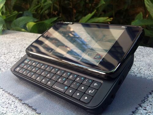
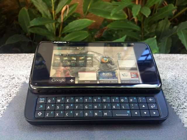
Hardware
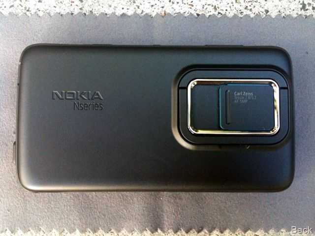
Let’s take a brief tour around the device:
Back: Camera with sliding cover and stand.

Left side: Speaker, micro-USB charger/transfer port, wrist strap eyelet.

Bottom: Nothing but the stylus silo.

Right side: Microphone, headphone and A/V out port, hold switch, speaker.
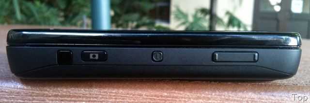
Top: Infrared port, camera button, power button, volume/zoom rocker.

Front: Light sensor (h), front facing camera (h), proximity sensor (h), earpiece, indicator light. [h = hidden in bezel]
The N900 has a 3.5 inch resistive touchscreen which has a resolution of 800×480. The CPU driving the unit is an ARM Cortex A8 processor running at 600Mhz. Included in the unit is 32GB of flash storage as well as a MicroSD slot for additional storage. The N900 also has Wi-Fi, Bluetooth, GPS and of course cellular connectivity and 3G (HSPA) data (oh, and a neat little FM radio tuner).
Shanzai.com looks at the MID operating systems choices
Posted on 30 November 2009
 The definition of a MID, a mobile internet device, changes with every person you ask but one thing remains constant. It’s aimed at the consumer and not the productive professional. That’s ultra mobile PC territory! Consumer devices require careful attention to ease-of-use and fun, dynamic software so the choice of operating system becomes just as important as the hardware it’s built on. Shanzai have a nice article up today that covers most of the options. I’d add Maemo to the list and remove any reference to Windows desktop operating systems but it makes interesting reading. At the moment it looks like the ARM/Android combination might take the lead in the 2010 market but as Moorestown and Moblin for handhelds feeds in, the choice might get tougher. One thing is certain in our mind though, if you can’t tailor and personalise your device with applications and widgets, it’s going to be a boring experience.

Nokia N900 Live Session Notes, Impressions, Videos (2.5hrs)
Posted on 21 October 2009
Thanks to the 850 people that dropped in to the session last night. We ran for about 4 hours and in that time you racked up 940 hours of viewing. That’s a lot of attention so clearly we’re getting something right with the live reviews.
The first thing to note from last nigh’ts N900 session is that there we didn’t find any show stoppers. Sizing is clearly an issue for some but within the bounds of the size of the device, Nokia have done an incredible job and married it with a software stack that is fit for the next-generation of ‘computing-first’ handhelds for both the geek and consumer community. Pricing appears to be acceptable to our target audience too. Over 85% of those voting in a poll during the session said it was value for money based on street prices we’re seeing of 500-550 Euros. In Germany the N900 is already free from some third-party resellers with high-end contracts.


 |
| |||
 |
| |||
 |
| |||
 |
| |||
 |
| |||
 |
| |||
 |
| |||
 |
| |||
 |
| |||
 |
|