In this article, it is my intention to take a critical look at the Android user interface. Some people may read this as though I’m lambasting Android, but this couldn’t be further from the truth. I quite respect Android as an excellent mobile operating system, but I also believe that looking critically at anything can be a healthy way to see what can be improved.
I’ve been meaning to write this post for a long time. In fact, I mapped the whole thing out almost a year ago, but it fell down my priority list and hid away for quite some time. After blowing the virtual dust off of my original organizational diagram for this article, I can see there isn’t much that needs changing. Many of the issues of the Android interface that I highlighted have not improved, or have even worsened.
I should clearly specify that this article is about the phone version of Android (ie: anything in the 1.x or 2.x range).
Another important part of this analysis is the belief that a good mobile phone interface is one that allows the phone to be held and operated with a single hand (ie: with your thumb). Smartphones go with us wherever we do and there are many times where we need to quickly reference something on them and don’t have two hands available to do it (or shouldn’t need to dedicate both of our hands to operating the device). There are definitely times where you’ll use both hands with your phone, but that’s often with you’re sitting down and focusing directly on it. One-handed use is the primary way we should be able to use our phones while on the go. Leave it to the larger tablets to require both of our hands for effective use.
The reason for the worsening issues is that Android phones are going through an unnecessarily-large-screen fad (at least, I can only hope it’s a fad). Increasing the screen size on a mobile phone, which should be able to be effectively used with one hand, makes a number of the problems worse than they would be with a smaller screened device.
I should also say that I’m not a GUI designer by trade, but I do spend a lot of time using and thinking about the devices and the interfaces that I interact with every day.
Well then, let’s get started.
Origins
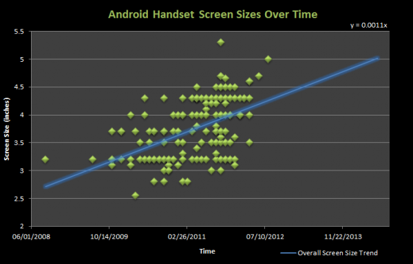
It’s important first to look back at how it all started. Before I begin talking about screen ratio and sizes, let’s look at the very first Android device, the HTC G1 (AKA Dream). The G1 was the very first Android phone ever released, and the phone was made specifically to fit Android the way it was originally designed. So how was Android originally intended to be shaped and sized? The G1 had a 3.2″ screen with a 3:2 [1.5:1] aspect ratio. Today, all the new latest and greatest smartphones are 4.3″ with a 16:9 [1.78:1] aspect ratio.
Screen Ratio
Based on the number of Android smartphones on the market that use a 16:9 [1.78:1] aspect ratio (960×540, 854×480) or something very close (800×480 [1.67:1]), you might think that 16:9 is some sort of holy ratio. Actually, it’s not so great for one-handed mobile use, and here’s why.
At its most basic, we can think of the range of thumb as a stick on the end of a pivot. When holding a phone in our hand in an orientation to use it with our thumb, the thumb hesitates to go any further down than about parallel with the ground. From this point, its range of motion is aprox. 90 degrees, up to a position where it is perpendicular to the ground. As soon as the ratio of the screen is increased beyond 1:1 (meaning for every unit of width, there is an equal unit of height {ie: 1:1 = square, 1:2 = rectangle}) you are decreasing the amount of the screen that the thumb can reach without “shuffling inch.
Shuffling is the word I’m using the describe the act of moving the phone up or down within your hand to be able to reach parts of the screen. Here is a visual that my buddy @bendrexl whipped up to help me explain:

This is the issue with widescreen aspect ratios on phones. The further you push the aspect ratio, the more screen real-estate exists outside of the range of the thumb. In general, the more square the screen and resulting interface, the more area the thumb will be able to effectively utilize it without uncomfortable shuffling.
It might be interesting for some to note that Apple’s iPhone has been using an odd 3:2 [1.5:1] since the first generation of the device, which is aprox. 16% ‘more square’, if you will, than the 16:9 [1.78:1] aspect ratio that’s commonly found on Android smartphones. As mentioned above, the original Android device, the G1, used the same 3:2 [1.5:1] aspect ratio as the iPhone, and an even smaller screen. The more square shape of 3:2 [1.5:1] means less shuffling than 16:9 [1.78:1] screens of the same size. The iPad uses an even more square 4:3 [1.33:1] shape.
Having a very rectangular ratio is also a pain for landscape app use. If you pull up the keyboard in landscape mode, the entire screen becomes dedicated to whatever text field you’re trying to type in and you can’t even see the context of where you’re typing.
Phone makers are going with 16:9 screens so that they can claim that their devices are great for watching movies, but honestly, how often are people sitting down to watch full length movies on their phones? Most phone screens still leave a lot to be desired over a real TV (not to mention, real speakers!). I’d much rather have a phone with a screen shape that is designed to be as easy to use as possible (because that benefits me every single time I use the phone) rather than shaping the screen for one particular activity which I rarely ever do on a smartphone.
Screen Size
Screen size also plays a very important part in how effectively our thumbs are able to reach the entirety of the screen. The 16:9 aspect ratio wouldn’t be as much of a problem if it was smaller, because a smaller 16:9 screen would be completely within the range of the thumb.
Unfortunately, phone manufacturers as of late are insisting that when it comes to screens, bigger is better. As an industry observer, I see this screen size push as a result of two things. 1) An attempt to ‘outdo’ the iPhone wherever possible, which has been using a 3.5 inch screen since the first generation of the device. 2) Compensation for the impreciseness of Android touch input, which is a somewhat worse, in my experiences, than iOS; a larger screen means it’s easier to hit the buttons you want.
We’ve seen phones like the original Motorola Droid ship with a 3.7 inch, which was quickly trumped by 4 inch screens on phones like the Samsung Fascinate and Sony Ericsson X10. Then came the 4.3 inch giants like the HTC Evo 4G, Motorola Droid X, and HTC HD2. [Before you say I forgot about the 4.8″ Dell Streak — that was designed to be used in landscape, which means two thumbs which cover much more of the screen]
") And that’s where we are today. 4.3 inch is the defacto mega-screen-standard for new Android phones. Don’t believe me? See the Droid Bionic, Droid X2, Motorola Atrix, Motorola Photon, HTC Thunderbolt, LG Revolution, HTC Sensation, and plenty of other already released and upcoming phones. Across the board, phone manufacturers believe that 4.3 inch is actually a reasonable size for a phone screen, but pushing the screen size up to 4.3 inch has major implications for the ergonomics of any phone, especially an Android phone, because of the interface (more on that later).
And that’s where we are today. 4.3 inch is the defacto mega-screen-standard for new Android phones. Don’t believe me? See the Droid Bionic, Droid X2, Motorola Atrix, Motorola Photon, HTC Thunderbolt, LG Revolution, HTC Sensation, and plenty of other already released and upcoming phones. Across the board, phone manufacturers believe that 4.3 inch is actually a reasonable size for a phone screen, but pushing the screen size up to 4.3 inch has major implications for the ergonomics of any phone, especially an Android phone, because of the interface (more on that later).
I’ve seen numerous commercials, advertisements, and press releases for these devices which tell us how “awesome inch the “huge inch and/or “gorgeous inch 4.3 inch display is (and presumably how it blows the 3.5 inch screen of the iPhone out of the water), but when I see these ads I just cringe. Here’s why:
The screen size increases, but the size of our thumbs does not. The range of our thumbs does not increase either. See the diagram to the left which shows two phones with approximately the same aspect ratio. One has a huge screen which leaves a large portion of the screen unreachable to the thumb without that atrocious shuffling, and the other smaller screen which is almost completely in range of the thumb.
The diagram obviously shows an exaggerated example, but phone manufacturers seem to be completely ignorant of the fact that our thumb reach does not increase as the size of their screens do. Huge screens mean more shuffling!
Look at this photo of someone wielding the upcoming Droid Bionic (4.3 inch, 16:9). Notice how they’re using two hands! [photo via Android Central]

Interface Design Compounds Screen Ratio and Size Issues
Screen size and screen ratio wouldn’t be a problem if the interface was designed in a way that clusters all of the important buttons and components in the area that your thumb easily reaches, reserving the harder to reach places for data and information that only needs to be seen, not interacted with (or at least not frequently interacted with).
Unfortunately, the design of Android’s interface does exactly the opposite of this. The most important/most used parts of an interface should be the easiest to reach. Let’s think about the most important parts of operating an Android phone:
The most important and persistent parts are the four Android buttons along the bottom of the screen and the status bar at the top, which pulls down to reveal notifications and sometimes other stuff like a wireless radio toggle.
Both the buttons (which I’ll call the ‘Android buttons’), and the status bar, are always persistent, no matter where you are in the OS. You have to constantly use the Android buttons to navigate through apps and the home screen, and you have to pull the status bar down with your thumb to access any notification that comes through to the device. The core functionality of the device involves reaching your thumb from even further below the bottom of the screen to hit the buttons, then all the way to the very top of the screen to pull the notifications menu down.
Can you see the issue here? The people responsible for the Android UI have placed the two most persistent and used parts of the interface on opposite ends of the phone, which, when it comes to large phones with eccentric aspect ratios, requires constant shuffling of the phone to go back and forth between them!
 Some phones make this even worse by placing their Android buttons further down from the screen than most. Look at the Samsung Droid Charge on the left; they put a freaking logo between the screen and the Android buttons, pushing them even further away from the rest of the screen, requiring even more stretching and shuffling!
There’s a simple software fix that could help alleviate some of this shuffling, and that’s to simply put the status bar at the bottom of the screen so that you can flick it up with your thumb without shuffling to the top of the phone to pull it down, then shuffling back down the phone to flick it back up! Putting the status bar at the bottom would put all of the important and persistent parts of the interface right in one convenient, easy to reach, location.
As far as I have found, no one has developed such a tweak yet, though I wish they would.
Inconsistency and Legacy
Inconsistency really irks me. It’s a huge no no in the interface world and yet some of the core interactions that happen every time you use an Android phone leave you not knowing exactly what will happen when you press certain buttons, or where you should be looking for certain buttons in apps.
The Back Button
Let’s start with the worst offender, the back button. The back button is one of the four Android buttons and you’re supposed to use within pretty much every app. When I press the back button on a phone I’m using, half the time it will not do what I expect it to do, and that’s because it can do so many different things. It isn’t always up to the user as to what it does, it depends on the situation (ie: it’s inconsistent).
Some questions that can be asked before you press the back button:
- How far back will it take me (back to the last webpage maybe? or maybe all the way out of the app?)
- Will it drop the keyboard?
- Will it close a menu?
- Will it take me back to another screen with the app I’m using?
- Will it take me back to the homescreen?
- Will it take me back to another app?
Unless the user is expected to track all of their prior actions and know what sort of back button usage every app has programmed into it, there’s absolutely no way for the user to know which one of these scenarios is going to happen, and sometimes when you just wanted to get rid of the keyboard, you’ll exit the app instead. Sometimes when you just want to go back within the app, it’ll take you back to another app that you might have come from previously. There’s no sure way to know.
Long Press ~ Right-click
Android sometimes favors the ‘long press’ that is: hold your finger down on something to get additional options.
I see the long press function as a legacy right-click. There’s a huge problem though. Think of a standard mouse. There’s two buttons on it, right? Naturally, you can see this and you will press both buttons because there are two there.
The long press, however, does not have a physical incarnation. There’s not button for the user to see and say ‘ inchhey, I’ll try this one inch. I’m sure there are many novice Android users out there who have no idea that the long press even exists, and I’m sure they’ve been digging through applications looking for some button and have been unable to find it because they don’t know how to long press (and I don’t blame them, there’s nothing that would make them think that a long press exists, unless they diligently read their manual, or carefully read all instructional app pop-ups {which I can safely assure you, few people do}).
Inconsistent App Paradigms
One thing Apple has going for its strict app guidelines is consistency. All iOS apps work on quite similar concepts by presenting everything within the interface (instead of relegating the back or search buttons to hardware buttons). There’s very rarely any long-pressing (in fact, I think Apple might actively discourage it).
I’ve sat and watched my 84 year old great-aunt, who has never owned a computer, operate an iPad with no problem. Part of this is because once she learned the basics, most everything else is very consistent and works on the same concepts, meaning that an entire new app is intuitive to use because it navigates and operates more or less the same way as other apps.
When it comes to apps on Android, inconstancy flourishes. Part of this is actually the fault of the popularity of iOS:
Google sets the example of how it thinks Android apps should operate by making its own apps. Take Gmail for instance, which uses a strict Android app paradigm. In Gmail, all of the navigational buttons are kept hidden away in the menu button, while most item-specific actions are kept to long presses.
Foursquare for Android, on the other hand, uses an iOS app paradigm which presents much or all of the navigational buttons directly on the screen. See here:

Because of the popularity of iOS, there are inconsistent app paradigms used across apps in the Android Market. Some use the Android paradigm, some use the iOS paradigm, and others yet use a confusing combination of the two where you’re unsure whether or not you should be looking on-screen, in the menu button, or in the long press menu to find what you’re looking for.
Because Google doesn’t enforce app design guidelines, you may end up with two apps on your device that work completely different. Neither paradigm is outright, better, but for the sake of the user, things should be consistent to encourage intuitiveness across apps.
I really hope that the mega-screen fad is just that… a fad. Perhaps the responsible companies will come to their senses eventually and realize that greater usability across the board is far more important than having a screen that’s slightly more enjoyable to watch movies on because of the shape and slightly larger size. When I use my phone, I want to be able to use it effectively, on the go, with one hand, rather than dedicated my full attention and both hands to its use. Furthermore, I’d love to see better consistency in app designs in the Market to make things intuitive, and not have to guess what the back button is going to do.