umpcportal home

Tag Archive | "photos"

HTC Status – Beautiful Hardware


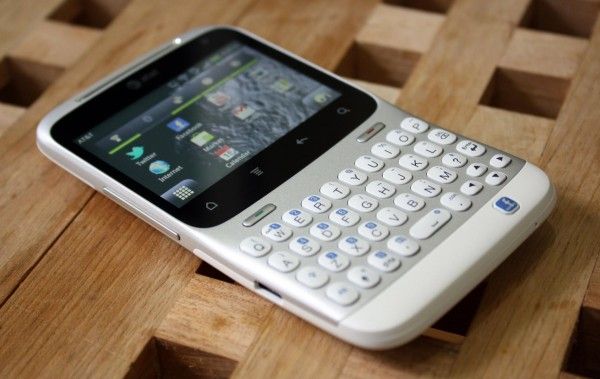
HTC kindly offered to lend us the HTC Status to have a look at and I was happy for the opportunity because it’s giving me some time to step back and look at Android on the lower-end of the phone spectrum. We tend to focus on the bleeding edge devices, and sometimes it’s easy to forget that not every person (in fact, the majority of people) don’t want to drop $299 on the latest phone every year. The HTC Status runs a cool $49 on contract which blows me away because this phone is pretty damn gorgeous.

The HTC Status is running Android 2.3 on a 2.6″ 480×320 (3:2) screen which is curious because this is the exact same resolution that the very first Android phone, the HTC G1 (AKA Dream), used. If you’ve read my analysis of the ergonomics of Android, you shouldn’t be surprised to find that, from an ergonomic standpoint, HTC is way easier to use with one hand. Instead of stretching and shuffling to read between the navigation buttons and the notification bar, it’s all right there, easily within reach.

The unfortunate fact is that almost all of today’s Android applications are designed with the assumption that the phone they will be used on is primarily portrait and with much more screen real estate. Despite how it may seem, I was actually really impressed with Android’s ability to scale everything down to the smaller landscape resolution of the HTC Status. Things are no doubt cramped at times, but the ability to adapt the entire interface, from something like the massive 5.3″ 1280×800 screen of the Samsung Galaxy Note to the relatively tiny 2.6″ 480×320 screen of the Status, is rather amazing.

HTC has never disappointed in the hardware department. Even though the Status will only run you $49 on contract, this hasn’t made any impact on the attention paid to the hardware. The Status feels great and I love the styling — it’s clean and sharp. The keys on the keyboard are firm and have near-perfect feedback when clicked.

HTC Surround Impressions


IMG_4938

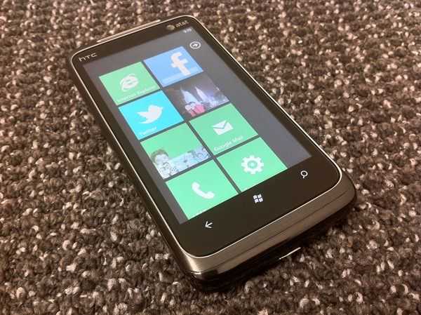
Surprise surprise, we’ve got a Windows 7 device to take a look at and it’s the HTC Surround! I’ve been itching to get my hands on a WP7 device, and I’m actually pretty impressed with the out of box experience. You know the hardware is decent, after all, this is an HTC phone, but the software is surprisingly mature for something that has been reworked from scratch and only recently released. Don’t get me wrong, there’s some areas where the HTC Surround hardware and WP7 software could use some improvements, but when you considered how new the platform is, things are looking good for WP7. I just hope they can gain critical mass to become a black hole of app development and customer attraction, instead of dwindling and becoming an ugly white dwarf.

I’ve compiled a few early thoughts and have the full gallery posted for your perusal.

Hardware

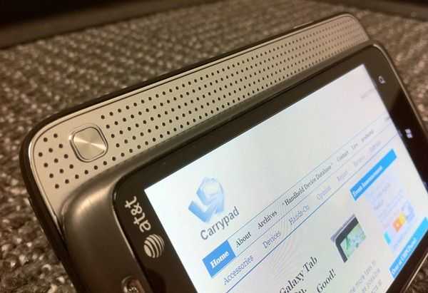
IMG_4964The HTC Surround is the first phone that I’ve tested in a while with any heft. This is a good thing! The last three phones I’ve tested (all Samsung) have all felt quite cheap with plastic exteriors. The Surround, on the other hand, feels like a quality piece of hardware. There’s brushed metal on the front, rubberized plastic on the back, and metal accents abound.

The feature for the Surround’s namesake is a sliding section that reveals a speaker bar (and a nice stand that pops out of the back). How/if/when this speaker will be useful has yet to be determined. There’s also a button on this sliding section that changes between some audio presets (even when you are using headphones). Still, my early intuition is that I’d rather sacrifice the sliding section to slim the phone down a bit and increase durability (no moving parts). But we’ll have to wait and see after some more testing.

Software

IMG_4945I’ll say it right here: I like WP7. It’s like a breath of fresh air from iOS clones (awful ones, or otherwise). The top-down concepts are similar (app driven, typical smartphone usage), but at least the GUI is really unique, and quite pretty. WP7 is the first mobile operating system that’s nailed iOS’s system-wide smooth scrolling and animation. This is a big plus for me. WP7 is also arguably more user friendly than Android out of the box. Speeds are very good and certainly comparable to the latest iOS and Android devices.

There’s still a lot for WP7 to improve upon, but at least it’s initial offering is decent.

Microsoft made a big deal about WP7’s “Live Tiles inch when they talked up the OS before release. So far, I’ve hardly seen these used. When they are, the information presented is almost always useless and just for show (AKA: waste of battery). I installed the Weather Channel app expecting to be able to see the conditions, or at least just the temperature outside on the Live Tile, but there’s nothing more than a static logo. Facebook and Twitter are the same. Facebook could show how many notifications I’ve got, and Twitter could at least show the number of how many mentions/DMs I have, but there’s no info in their Live Tiles.

The brings me to another sore point: WP7’s notification system. I tweeted earlier that “I can’t tell in the WP7 notification system is awful, poorly implemented, or just non-existent. inch Yeah, it’s that bad. I don’t seem to get any notifications through the phone expect for email or SMS which shows up as an icon on the lock screen and as a number on the Live Tiles of the respective apps.

I’ll have to leave you guys with these thoughts for now. I need some more time with the phone and software before crafting the full review. Stay with us to see how the combination of HTC and WP7 stack up to the competition! And definitely shout-out in the comments if you want to see anything tested in particular in our review of the phone.

Nexus S Gallery


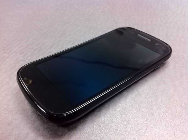
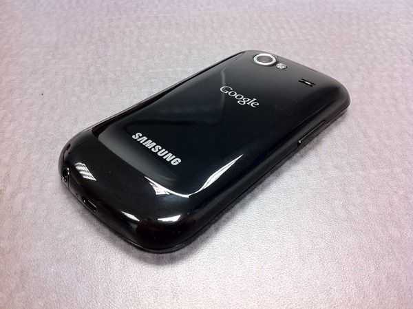
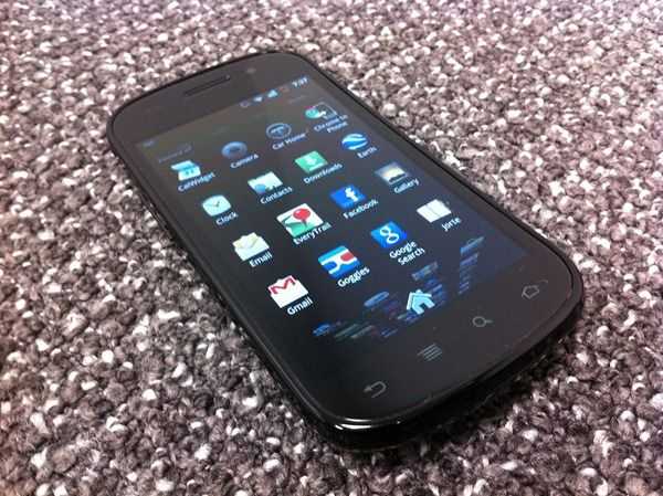
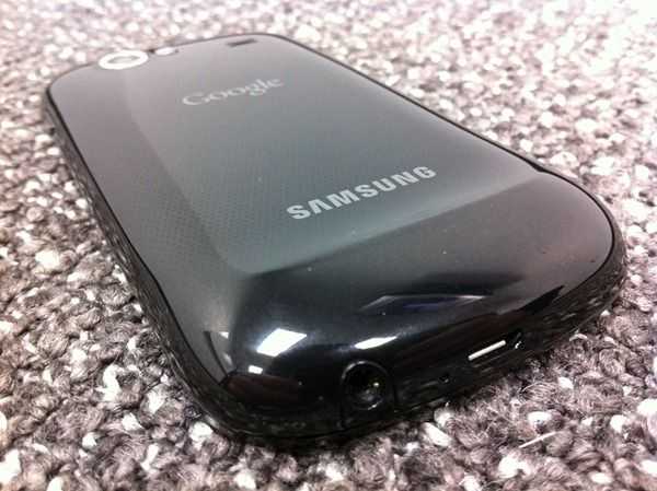
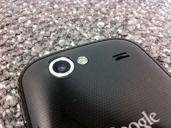
We’ve had our hands on the Samsung/Google Nexus S [tracking page] for a few days now and are putting the phone and the OS (Android 2.3) to the test. You may have caught the overview video already, and now we’ve got a bit more to tide you over until the full review, a full gallery! A few choice photos are below, but be sure to swing by the gallery itself if you’re interested in the Nexus S. And while you’re here, let us know in the comments if there’s anything specific that you’d like to see covered in the review.

IMG_4873

IMG_4879

IMG_4916

IMG_4884

IMG_4883

Motorola Droid 2 Gallery


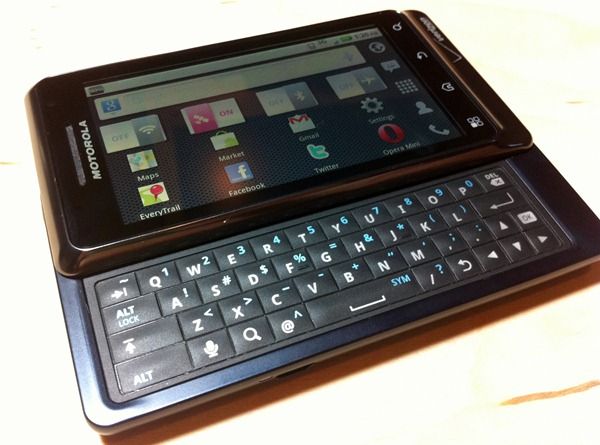
IMG_2729We’ve just added high res shots of Motorola’s Droid 2 to the gallery. Head over and check them out and stay turned for the full review, coming to a Carrypad near you!

iPhone 4 Review


I have to preface this review with an apology. It’s taken me a long time to get this review up on the site and I’m sorry for that. You knew not to expect a day-one review from us because that’s just not how we roll; we like to get a serious feel for the items we’re testing before passing judgment. I was waiting for apps to be updated with iOS 4 features, and for Apple to tell their side of the antenna story before writing the review (not to mention getting distracted with the Droid X). With that said, I hope you’ll still join me for our iPhone 4 review.

Hardware

2010-08-09_19-30-48_22 The iPhone 4 introduces an all new design. Here’s a quick spec rundown, and as always, you can get detailed information from our iPhone 4 Portal page.

  • CPU: Apple’s A4 chip (1GHz)
  • RAM: 512MB
  • GPU: PowerVR SGX 535
  • Screen: 3.5 inch IPS display @ 960×640 (326 ppi)
  • Rear camera: 5 MP with single-LED flash (HD video record capable)
  • Front camera: 0.3 MP (video up to 640×480)

Design
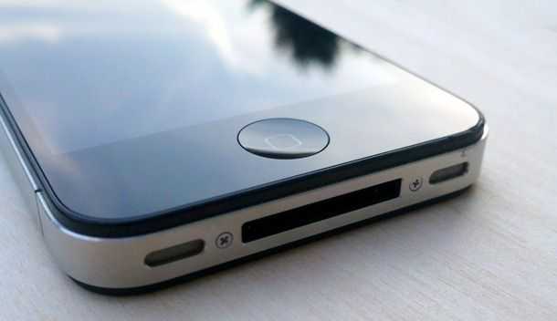
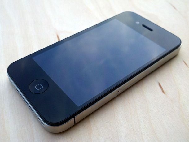
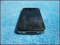
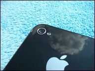
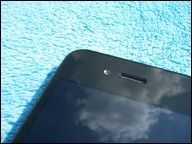
2010-08-09_19-33-51_256 You’d have to really despise Apple to say that they have no design talent. The iPhone 4 once again makes its predecessor feel like a toy, despite the fact that it once felt like a quality built device. The iPhone 4 is 24% thinner than the iPhone 3GS, making it the thinnest smartphone in the world (according to Apple), though despite it’s decreased thinness, it doesn’t feel thinner than the iPhone 3GS because of its square back. The iPhone 3G and 3GS had rounded backs which made them feel thinner than they really were. The result of this lack of rounded back makes the iPhone 4 feel just as thick as the iPhone 3GS.

The front and back of the device is made from glass which Apple lauds as being much stronger than plastic. I’ve somehow managed to already get more scratches on the front of the my iPhone 4 than I did over the entire course of my iPhone 3GS’s lifespan. They aren’t significant scratches, but hold the phone under the light and you’ll find quite a few. This is a striking contrast to my iPhone 3GS which never got a single scratch on it.

This could have something to do with the fact that the glass back of the iPhone 4 is somewhat slippery compared to the plastic back of the iPhone 3GS. The iPhone 4 isn’t slippery in the hand, but it frequently slides off of places where I once rested the 3GS, such as on top of my wallet, or on the arm of a couch. Some people have attributed this to the oleophobic coating which is designed to reduce fingerprint smudges (this was only present on the front of the iPhone 3GS, but it’s on the front and back of the iPhone 4).

The front and back of the iPhone 4 is glass, but there is a tiny plastic bezel that surrounds each pane. This is likely to prevent any dangerously sharp edges, as well as reducing the chance of chipping the edge of the glass.

As for the look of the device itself, it’ll definitely come down to personal preference. I, for one, think it’s a beautiful looking device, and I’m happy to see Apple working on a somewhat retro look, rather than continuing to evolve their previous design the natural conclusion of which would have eventually been the iBall — if Apple continued to simplify shapes and smooth lines.
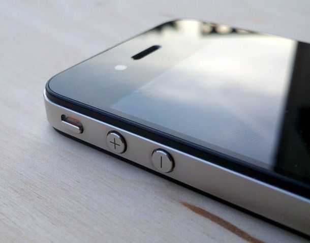
2010-08-09_19-28-32_725 The device feels undeniably well built, and the metal buttons are impressively solid and have no play to them. The volume buttons have been changed from a rocker bar (as they were previously on the 3GS) and separated into individual buttons. The plus and minus markings are cut directly into the metal button which gives them a sharp look that won’t be worn away over time. Both volume buttons, the silent switch, and the hold/lock button have highly satisfying clicks. Additionally, the home button on the front of the device is much more clicky than the one on the iPhone 3GS which was occasionally on the squishy end of the spectrum. If you’ve ever used an iPod Touch, then you’ll know the feeling of the iPhone 4’s home button.

Screen
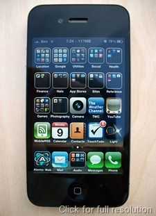
112_1027 Apple specifically designed the screen to have a pixel-per-inch rating that surpasses the eye’s ability to tell each pixel apart. Apple claimed that this threshold was about 300 ppi at a given distance (10 inches or so) so they made the screen 326 ppi with a 960×640 display which is 4x the resolution of previous iPhone. Just to clarify, the increase in resolution doesn’t mean more space on the screen. Instead, Apple scaled up graphics of the entire OS to 4x their original size to fit the new resolution. The result is an extraordinarily crisp screen that makes you wonder how you ever lived with the low res 480×320 screens on the old iDevices.

When I look back at an iPod Touch or previous iPhone, the screen looks quite pathetic. The iPhone 4’s 960×640 screen is the highest resolution in a smartphone, but next to an 800×480 device like the Droid X [portal page], the difference won’t be perceptible for most people. So while the iPhone 4’s display blows the previous iPhone out of the water, it isn’t wildly superior to other devices out there.

The IPS screen is reasonably readable in bright sunlight and has an impressive full 179 degree viewing angle with virtually no loss of color or contrast at even the most extreme angle.

One Day Early – iPhone 4 Unboxing Video and Photos


Looks like we were one of the lucky people that got our iPhone 4 [Portal page] a day early, and fortunately that means you get to take a look at it a day early with us. Check out the video unboxing below as well as some photos. Just to note, I mentioned that the iPhone 4 doesn’t come with a SIM ejector, but I didn’t say that it also doesn’t come with a polishing cloth as the iPhone 3G once did. Stay tuned for more.
101_0653
101_0662
101_0656
101_0664
101_0666

New Dell Mini 5 Hands-On Photos and Video from Engadget


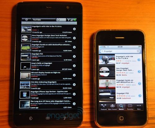
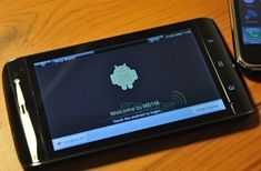
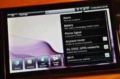
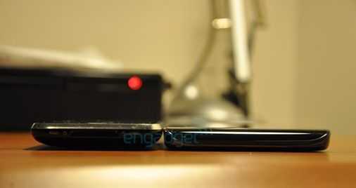
Engadget has managed to get their hands on a pre-production Dell Mini 5 [Portal page] (aka Dell streak or M101), and they’ve got a nice gallery of the device up on their site as well as a brief video. Hopefully they’ll drop some hands-on impressions later, but for now it’s pretty much just visual media. I’m most interested to see what they think of the off-centered QWERTY keyboard which is offset due to a seemingly always present numeric OSK — the keyboard could make or break this device. Check out a few shots below and jump over to Engadget for the full gallery and video.

dell mini 5 5 dell mini 5 dell mini 5 2dell mini 3

N900 and iPhone 3GS camera comparison shots


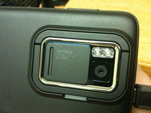
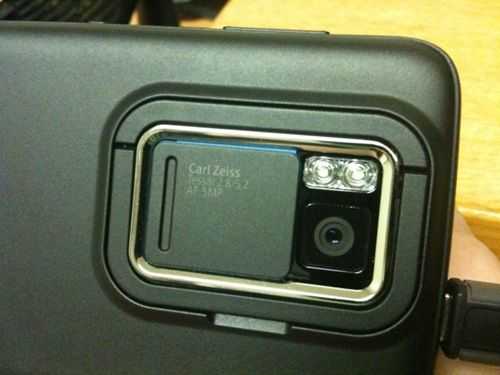
photo (2) One of the coolest features on the Nokia N900 is the pretty awesome camera. The N900 has an auto-focus 5.0MP camera with a dual-LED flash (with a sliding cover). The optics are by Carl Zeiss which are regarded as being high quality in the world of cameras. I’ve got several shots taken by the iPhone 3GS’s 3.0MP auto-focus camera and put them up against images taken with the N900. You’ll see the iPhone’s photos on the left and the N900 shots on the right. Be sure to click on the images to get the full-sized photos.

iphone n900

iphone (2) n900 (2)

iphone (3) n900 (3)

iphone (4) n900 (4)

iphone (5) n900 (5)

iphone (6)

n900 (6)

iphone (7) n900 (7)

IMG_2505 20100117_003

After looking through these images, it is pretty clear to see that the N900’s 5.0MP camera takes sharper images than the iPhone’s 3.0MP camera, which makes sense of course. Looking very closely though, it would appear as though the N900 also has a better dynamic range than the iPhone. What this means is that the N900 can capture a wider range of dark and light in the same scene than the iPhone can. You may have also heard of this term referred to as contrast ratio. This is apparent in most of these images if you look closely, but it’s particularly visible in the photo of the underside of the tree. Much more detail can be seen in the dark regions of the N900’s shot than can be seen in the iPhone’s. Colors appear to be more accurately represented as well. In the second to last shot of the flowers, the iPhone image seems to have oversaturated colors, whereas the N900 more accurately shows the range of pinks.

The macro mode on the N900 is probably the thing that most impresses me. The N900 has the benefit of having a dedicated hardware camera button which, when pressed down half-way, focuses the camera (with the iPhone you tap on the screen to focus). Turning on the macro-mode on let’s you get up-close and personal to objects and let’s you capture an impressive level of detail and texture.

A full N900 review is in the works, stay tuned!

Follow Chippy on  TwitterFollow Chippy on  YouTube

Popular mobile computers on UMPCPortal

Acer C740
11.6" Intel Celeron 3205U
Acer Aspire Switch 10
10.1" Intel Atom Z3745
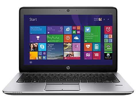
HP Elitebook 820 G2
12.5" Intel Core i5 5300U
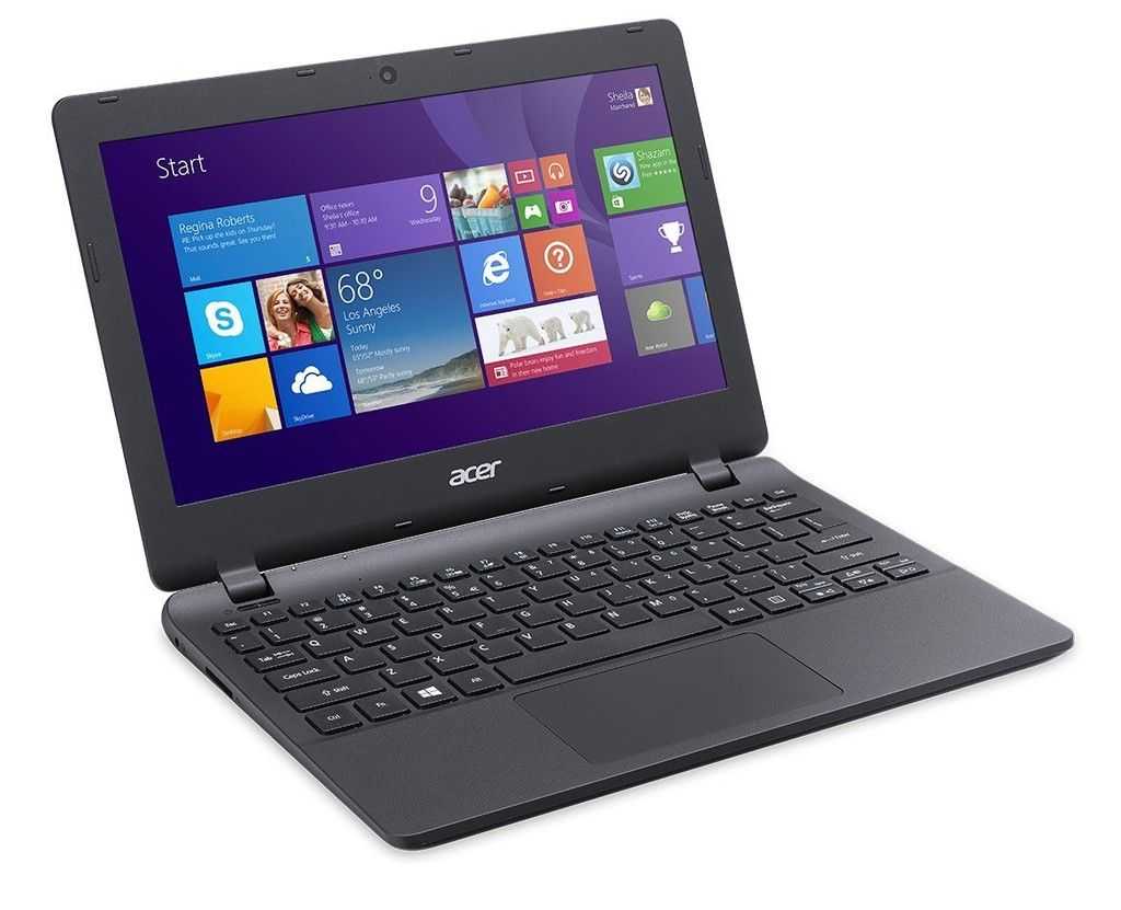
Acer Aspire E11 ES1
11.6" Intel Celeron N2840
Acer C720 Chromebook
11.6" Intel Celeron 2955U
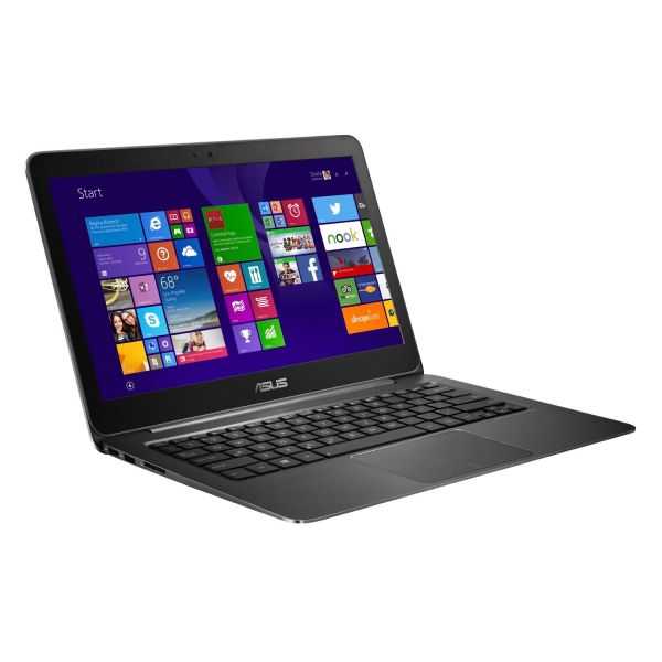
ASUS Zenbook UX305
13.3" Intel Core M 5Y10a
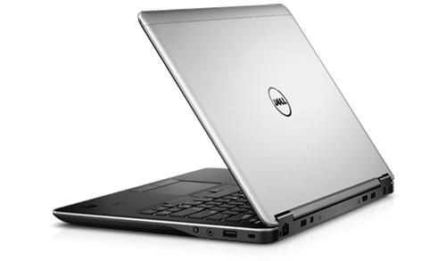
Dell Latitude E7440
14" Intel Core i5-4200U
Lenovo Thinkpad X220
12.5" Intel Core i5
Acer Chromebook 11 CB3-131
11.6" Intel Celeron N2807
Lenovo Ideapad Flex 10
10.1" Intel Celeron N2806

Find ultra mobile PCs, Ultrabooks, Netbooks and UMPCs quickly using the following links: