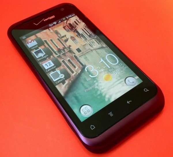
The HTC Shift. A fantastic design that failed due to overly heavy operating system, a short battery life, low screen resolution and limited Windows Mobile implementation.
Over a year of rumors and false-starts the HTC Shift became the most viewed device on UMPCPortal by a long shot. Videos of it were always popular and even after it launched, communities grew quickly and great things were done with the device. The short battery life and high cost killed it in the end through and as smartphones took off and even due to Intel moving towards the MID, it lost ground quickly.
Still, it’s an amazing bit of engineering and there might even be a few use case left for it. Certainly a 30 minute session in the coffee shop could be worth a lot of fun and a few discussions!
At $199 it’s worth a but of fun and maybe worth trying some Ubuntu, ChromeOS or other lightweight OS. Unfortunately this isn’t the 3G version. Anyone up for it? Or maybe you’re waiting for the updated version?!
I’ve been following a disturbing trend over the last few years as the Android platform (and now WP7 as well) matures. Smartphone screen sizes just keep growing and growing, and they don’t seem to want to stop. I have a number of issues with smartphones that have overly-large screens. It pains me to see that, while Android is known for giving users many choices, it’s nearly impossible to get a reasonably-sized flagship phone. For me, for a smartphone to be a ‘smartphone’ at all, and not a tablet, it has to be easily usable with one hand. Of course then the definition of smartphone/tablet will change from person to person, because our hands are not all the same size, however, there is certainly a finite limit for everyone where a phone will become too big to be comfortably used with one hand.
I’m currently testing the Samsung Galaxy Nexus. So far it’s been a rather wonderful phone, and I recently wrote this on Google Plus:
I’ve been using the iPhone for 3 generations. Right now I’m testing a Galaxy Nexus. If they made the same exact phone in a size that’s actually comfortable for one-hand use, I might call myself an Android convert. Curse you 4″+ screens and the awful fad that you are!
For me, the 4.65″ screen on the Galaxy Nexus is just too big. I constantly have to shuffle the phone around in my hand because Android places the two most frequently used aspects of the interface (the menu buttons and the notification drawer) at opposite ends of the phone. The size of the phone and the required shuffling means that I’ve got a poor grip on it, and I’ve been rather worried about dropping it during use. Again, those with larger hands will not have the same issue at 4.65″, but at some point they will run into the same problem.
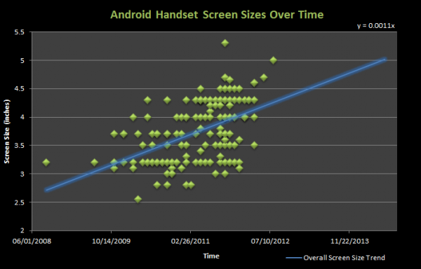
Android Handset Screen Size Over Time
To show the trends of Android smartphone screen sizes over time, I compiled screen size and release date data from 155 smartphones from five major manufacturers (Motorola, Samsung, HTC, Sony, LG). I’d like to thank PDADB.net for their comprehensive release date info. (click to enlarge graphs)
As you can see, since the introduction of the 3.2″ HTC Dream / G1, screen sizes have consistently increased. Today we’re seeing 4″, 4.5″, 4.7″, 5″, and even 5.3″ smartphones! A simple projection (seen on the main chart) suggests that before 2013 is out, many handsets will have 5″ screens, while the flagship phones of that time may have even larger screens (if this trend continues) of 5.5″ or perhaps 6″.
With a slope of 0.0016, LG is increasing its Android smartphone screen sizes the most rapidly of these five manufactures. Despite pioneering some of the largest phones on the market at certain points in the timeline, Motorola is actually showing the slowest rate of increase in Android smartphone screen size with a slope of 0.0009, but of course this isn’t very far off from the leader!
Why is This Happening?
A good question to ask is what’s prompting the growth in screen size. It seems natural for manufacturers to have experimented with screen sizes as the platform grew legs. Different screen sizes are a point of differentiation for an Android phone manufacturer — a way to stand out in a sea of similar options. Bigger screens were also an easy way for companies to try to beat out the iPhone on features, even if the ‘bigger is better’ argument doesn’t hold much water in this case. Now it seems to have turned into a snowball effect whereby manufacturers are trying to one-up each other to have the biggest screen in town (all the while, Apple has stuck with 3.5″ since the introduction of their handsets). You wouldn’t believe how many times I’ve heard the phrase “biggest and baddest” when marketers are referring to a new Android phone. They use this phrase as though bigger is always better, but I must say — when it comes to comfortable one-handed smartphone use — it is not.
Where Does It Stop?
My question is this: where do we draw the line? As I mentioned, despite variations in hand sizes, everyone reaches a limit of comfortable one-hand usability at some point. I don’t have the raw data to back it up, but I believe that Android smartphone screen sizes are rapidly surpassing the maximum size for comfortable one-handed use by the average Android customer. None of this is to say there aren’t advantages to having a larger screen (particularly when it comes to media viewing), but given that people much more frequently use their smartphones for apps rather than media viewing, the argument for surpassing a users one-handed comfort zone to provide a better media experience is a poor one.
It’s not so much that screen-sizes are increasing (the chart clearly shows that other sizes are still available), but the bothersome fact is that it’s near-impossible to get a flagship phone unless you’re willing to buy one of the massive phones on the market. If you want a phone that comes in a size that’s comfortable for one-handed use, you have to be willing to settle as a second-class Android citizen — the only options available to you will likely have slower processors, less RAM (and may be based on an older platform) than the newest and biggest flagship phone currently on the market.
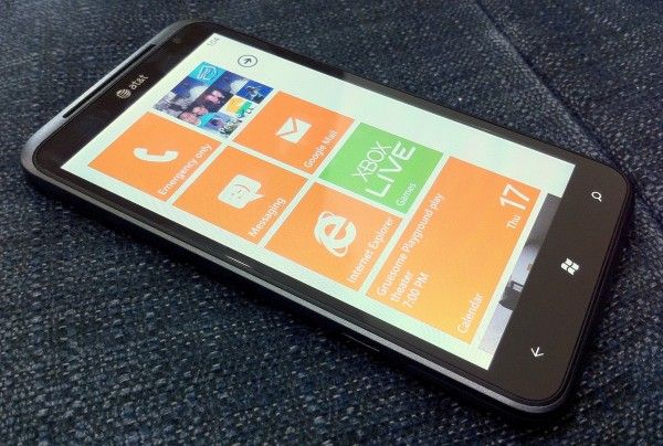
I’ve spent the last several days with the HTC Titan, a WP7 phone with a zippy 1.5GHz CPU and a huge 4.7″ screen. I’ve been keeping a running list of areas where WP7 is lacking, or places where they could push it to really excel. If these things were fixed, I would switch from iOS (which I’ve chosen to use for my last 3 phones) to Windows Phone 7 and recommend that others follow. And just so it is clear, all information in this article pertains to Windows Phone 7.5, AKA Mango.
To start, I want to point out that I’m extremely impressed with WP7. This is one of Microsoft’s biggest consumer facing undertakings in the last few years, and I see massive potential in the OS. WP7 is beautiful and unique. I’d call it the best looking OS on the market today, hands down. It makes Android and iOS feel like they were designed in a veritable stone age of mobile OS design.
Most unfortunately, it’s lacking in a number of vital areas. A friend asked me what I thought of WP7 the other day. Because he isn’t a tech-geek like myself, I used a metaphor. I told him to imagine the most attractive sports car he’d ever seen. With the car come a few caveats: the steering wheel sucks and it doesn’t have any tires. Although my choice of steering wheel and tires weren’t supposed to represent specific issues with the iOS (but rather say: it’s missing stuff), looking back now perhaps mentioning the tires was a good choice, after all, the OS is lacking traction.
If I didn’t think WP7 had tremendous potential, I wouldn’t be wasting my time or yours with this article. But I truthfully think that WP7 has something special going for it. Microsoft just needs to hone it and push it hard. My hope is that this list gives them a good place to start:
The List
Core Social Applications — Facebook, Twitter, and Google Plus, are necessary to offer the majority of users access to their preferred social networks. Even more if you hope to include everyone. Official Facebook and Twitter applications exist, and while they look nice, the functionality is quite weak. Facebook has hardly any native support for the things that users actually do within it. You’ll find that you are constantly getting kicked out of the app and into the browser to a mobile site, and half the time you’ll be met with a frustrating error message once you arrive there. Both Facebook and Twitter suffer greatly from the fact that notifications in WP7 are poorly implemented. Google Plus doesn’t exist as an app on the app Marketplace, and the browser doesn’t support the most modern version of the Google Plus web app, instead dropping you back to a version that would likely still be supported by my Palm OS running Sony Clie UX50.
Multi-calendar Support through Gmail — This is simply frustrating. You have the option to configure a Google account directly in WP7, and you can select if you want to sync calendars, contacts, and email when you create it. This makes the user believe that all of these things are fully supported, but there is no indication that there is no support for sub-calendars in Google calendar. If you are a serious Google Calendar user, you likely have a number of sub-calendars under your main calendar for better organization. Unfortunately, only the main calendar will sync over, so if rely on sub-calendars, you are out of luck.
Notification System — It is claimed that WP7 has notifications. Evidence of these notifications, however, are completely absent. I’ve spent nearly a week very close to WP7 with Facebook, Twitter, and Email accounts configured on the device, and I’ve not seen one single notification unless I explicitly look at the Me hub (more on that below). I actually had my iPhone sitting next to the HTC Titan and was using the iPhone as a notification system to decide when to check the Titan; this was almost comical!
Expand the ‘Me’ Section — The ‘Me’ section of WP7 would be the notification center of the OS, if notifications actually existed. This brings together your notifications into one place and let’s you interact with them. Between iOS, Android, and WP7, the Me hub is the only native system that I would actually consider using, but it needs a lot of work and it will require maintenance. The promise of the Me section is to bring your life into one place. The Me hub is unique beyond Apple’s Notification Center and Android’s Notification Menu because instead of dishing you out to other apps, you can interact directly with the notifications. For twitter mentions, you can send a reply, and for Facebook posts, you can comment, like, etc.. This is really awesome, but it needs deep support if people are actually going to use it. At the moment, it really only consists of Twitter and Facebook. Why email isn’t included is beyond me. When I wake up in the morning, I grab my phone to see what I’ve missed. Usually there are a few texts, emails, and some social network notifications. These should all go into the Me section so I can see everything at a glance, and respond to them if needed, without jumping out to other apps and becoming distracted by noise within. In order for the Me section to prosper, it needs support for a greater number of social networks, needs to (optionally) wrap in email, and it needs to be on it’s toes about updates. I will always use a first-party or third-party app over OS=level implementations if the OS level implementation lacks support for the stuff that I actually want to do (like posting to a Facebook group, or including a photo in a tweet). When new social network features come about, users are not going to wait 6 months or a year for the OS to be updated to support them, instead they are going to leave for a readily available app. Keeping the Me section on its toes could be done in two ways: 1) having an internal team dedicated to making sure that every way that a user might want to interact with a notification is covered. This will require the ability to do automatic OTA delta-updates. 2) alternatively, make the Me hub completely developer driven by allowing applications to push info into it. This way, you’ll never end up with broken or missing functionality, because once the app gets updated, its interaction with the Me hub will be updated as well. The Me hub also needs to alert the user that there are new notifications from the lock screen. Currently, an unread email count is the only info you get on the lock screen with regards to notifications.
Skype — Microsoft owns Skype and yet it is on every major mobile OS (yes even WebOS) except for WP7. Do I need to say any more?
Quick Jump to Top and Bottom of Start Screen — Because of the design of the Start screen can cause it to get rather long, there needs to be a way to quickly jump to the bottom. Currently, you can tap the Start button while on the Start screen to jump to the top of the list, but there is no way to quickly get to the bottom. If you are at the very top of the Start screen, the Start button should send you to the bottom of the screen and vice-versa.
Next/Last Input Field Navigation — When entering text into a text field in the web browser, it can sometimes be difficult to select the next input field because it has the tendency to get cut off by the keyboard (which has a hit-zone that expands beyond where the keyboard stops visually). This means that you see a sliver of the next text box and try to tap it, but end up pressing a key instead. Having buttons to navigate between input fields (like on iOS) would be very useful.
Faster Access to Tabs in Web Browser — I don’t think any serious computer user has used Android and asked, “Why is it so annoying to manage browser tabs?”. WP7 is making the same mistake. Getting to the tab menu in the browser requires that you pull up the URL bar, tap the tab button, then make another input to close, select, or create a new tab. This is too many taps to get to tabs and the result is that tabs become underused and the person using the browser uses it less efficiently than they should be able to. Improving interaction with tabs in the browser quickly and easily increases the productivity of those using it; they will thank you.
Better Standards Support in Browser — It seems that Internet Explorer will never be able to shake free from the chains of its past. Yes, I said it: standards support in IE on WP7 sucks, and that’s not surprising to anyone. Between WebOS, Android, iOS, and WP7, I bet you can guess which one scores the lowest on the HTML5 test. Having weak standards support means that when you don’t have native apps (and let’s be honest, this is a problem for WP7 right now), at least users can fall back to modern web apps which are usually a decent replacement. Unfortunately, because of the lack of standards support and a useragent that no one seems to care about, users get stuck with simplistic web offerings. Having a browser that works as expected is also tied to the confidence you have when using it. If I want to buy concert tickets through some no-name website through iOS, I’d put my money on it working with no problem. With IE on WP7, I’d bet against the process going smoothly. I want to have confidence that I can do anything on my mobile browser (within reason) that I’d be able to do on my desktop browser. IE on WP7 does not give me that confidence. Just for reference, here’s the current HTML5 test tally for modern mobile browsers:
Open in Background Tab — In addition to making tab interaction faster, there really needs to be a way to open a link in a background tab. Unless you have the attention span of a hyperactive child, you probably choose to read information online while opening relevant links in the background to check through after you finish the current material. Opening in the foreground is just distracting and forces the user to navigate back to the original tab.
Global Landscape Support — Windows Phone 7 has the most responsive and best looking transition from landscape to portrait of any mobile OS. Show it off! Landscape support is a scarcity throughout the OS. At very least, the multitasking menu needs landscape support so that when you pull it up from one of the few apps that do support landscape, it is oriented the right way.
Deeper Live Tile Functionality — I think Live Tiles are a great idea, but they aren’t being used often by developers. Where they are used is often for eye-candy rather than functionality (like the People hub which flips through a bunch of photos that are too small to really see). Talk to developers and find out what tools they need to best use Live Tiles, and encourage them to make use of this unique functionality!
Expand Pin to Start and XBL Friends List— Pin to start is another great idea. On iOS, there are specific albums that I love to listen to, but every time I want to play them, I have to launch the Music app and navigate through some menus to find them. In WP7, I can ‘pin’ these directly to the home screen and play them with a single tap, which is awesome. I want to see more of this. Specifically, you need to allow Xbox Live users to pin their friends list to the start screen, and then, using Live Tiles, you should be able to see how many friends are online. Invites, messages, and friend requests from XBL friends should probably end up in the Me hub, but I think a case could be made for leaving them in the XBL hub.
Change Accent Color Automatically — The accent color (configurable in the Settings app) is a cool way to spice up your phone, but it’s bothersome to change manually. There should be an option to have the accent color change by the day, week, or month. This way, instead of finally deciding, “I’m bored with this color,” and then finally changing it manually, you can be surprised by a new color on a new day, week, etc.
Use LED Light for Notifications — The HTC Titan has an LED on it which does nothing more than indicate charge status. This should be tied into the Notification System, should one ever actually exist.
Quick-scroll to Top of Page — Some webpages are long (like Wikipedia articles), this is a fact of life. Please find a way to allow the user to jump to the top of the page quickly because that’s where most websites’ navigational elements are found.
Folders — I understand that ‘folders’ might feel outdated; call them Magnets if you must make them sound as trendy as the rest of the OS looks, but they are necessary on the start screen regardless. I know the folks responsible for WP7 can think of a beautiful way to display folders to the user on the Start screen. Make it happen, otherwise my Start screen is going to end up being 5 miles long. Additionally, newly installed apps should be highlighted on the app list, instead of making you hunt them down through their alphabetic sorting. Offer pin-to-start at app install so that the user can skip the step of installing, finding in the list, then pinning.
Hire the people From Lazy Worm to Make Your YouTube app — or license their existing app and include it with all windows phone 7 devices. This is the one dev I’ve seen that’s making full use of Live Tiles and Pin to Start functionality, check out this video demo of his upcoming Metrotube app which lets you pin your favorite YouTube subscriptions and see when they are updated through the Live Tile.
Faster way to Return to Root of App — When you are 5 menus deep within an app, it’s annoying to press the back button 5 times in order to return to the top level of the app. There needs to be a way to jump to the top level in just one press or gesture. Pressing at the heading of the app might be an option, or perhaps a pull down gesture might do the trick.
And that’s what I’ve compiled over just several days of using Windows Phone 7.5 Mango, there will certainly be more to come. I submit this as an earnest list of what I hope Microsoft can fix and improve with WP7. The OS has massive potential, and I would like to be able to call myself a WP7 convert, and confidently tell others to follow me, but there is work to be done by Microsoft before that will happen.
Have anything to add to the list? Please drop a comment!
I’m giving the HTC Titan and Windows Phone 7.5 (Mango) a test drive. As usual, the HTC hardware is a beauty. I think HTC hardware paired with Windows Phone software could be a winning combination. That’s if, and only it, Microsoft ups their game. See my overview video below:
The HTC Rhyme is an attempt to incorporate a little feminine charm into a product that runs an operating system that is typically represented in products that are completely black, have sharp edges, and seem to shout, “THIS PHONE IS FOR GUYS!” Is a feminine touch enough to appeal to different demographics? Read on to find out.
Design
You’ve heard us say it before, and it’s about to be said again. HTC makes beautiful hardware. The Rhyme is no exception. Even though it is smooth and svelte, it’s also solid and lean. Materials feel high quality and the HTC Rhyme is nearly as thin as the iPhone 4S. The back of the phone is matte so you won’t often need to wipe it clean of fingerprints unlike some other glossy devices.
The back is indeed removable but the battery is not. Popping the trunk only offers you access to the MicroSD card slot which comes pre-installed with an 8GB card. The back casing of my review unit didn’t seem to go on quite right (you can see this in the first photo of the Hardware Tour), but I do believe this was a unit-specific issue.
The lock/power button could have a bit more click to it for my taste, but it is raised sufficiently so it’s easy to find. The volume-rocker actually has the opposite problem — it’s a bit flat so it can be hard to feel, but it clicks sufficiently.
For me, the size of the phone is very nice. The 3.7″ screen of the HTC Rhyme sits in the hand easily and can be operated sufficiently with just one hand without a bunch of shuffling, as required by many of the 4″+ screens on the market. Aside from the color, I wouldn’t say that there is anything outwardly “feminine” about the HTC Rhyme. The shape and design otherwise seems to be a perfectly neutral. Slap a different color on it, and I think plenty of men would be just as happy to use the phone as women. In fact, I did see some press photos of a champagne and light blue version of the Rhyme, but I’ve not seen those colors actually available for sale anywhere:
Hardware Tour
Right: Volume rocker
Top: 3.5mm headphone jack, mic, lock/power button
Left: MicroUSB slot (covered)
Bottom: Nada
Display
The HTC Rhyme’s 3.7″ screen is pleasantly vibrant and crisp. It’s rocking an 800×480 resolution, which doesn’t put it up there with some of the other insanely pixel-dense devices on the market, but the 3.7″ screen doesn’t quite necessitate it.
Viewing angles are top notch all the way around the screen, and auto-brightness does a good job of keeping the display at appropriate levels. Black-levels are typical for an LCD display, which means they’re pretty awful compared to AMOLED displays. Unless you regularly watch high quality movies on your phone, or you’re a photo buff, you probably won’t notice the poor black-levels.
Software
The HTC Rhyme comes installed with Android 2.3.4; HTC hasn’t yet said whether or not the phone will receive an update to Ice Cream Sandwich.
On top of Android is HTC Sense, a set of custom graphics and widgets that run throughout the system. Some people have grown fond of HTC Sense, but I’m sure there are an equal number of people who, like me, would rather not use Sense. Unfortunately, Sense cannot be disabled.
While Sense does add some widgets and other functionality to the HTC Rhyme, the proprietary nature of the skin means that you’ll end up waiting longer for Android updates, and might miss out on features until HTC decides to update Sense. For instance, let’s say that you like to go into your contacts page to see a friend’s Facebook status updates. Hypothetical: All is working well until one day Facebook adds some new feature that allows people to add short audio clips to their status updates — because that feature didn’t exist when your version of Sense shipped, the phone has no idea how to handle it, thus you cannot access the content (or post your own audio clips from Sense’s proprietary Facebook integration).
With the pace of updates and changes to our various social networks and other online services, trying to use software that is built into the firmware of the phone is just a pain, especially given the update track record of various Android phone manufacturers. Another example: even with the latest HTC Sense twitter client (which doesn’t exist as an app on your home screen but can be launched from a widget — totally confusing) still doesn’t support lists. Lists were added to twitter back in 2009.
One of my biggest pet peeves for Android skins is when they waste space in the notification menu. When I pull down the notification menu, I want to be able to see as many of my notifications as possible, not scroll through them one by one. The more space wasted in the menu, the less notifications I can see without scrolling.
On the HTC Rhyme’s notification menu, there is the obligatory carrier branding at the very top which takes up at least one notification slot. Below that is a scrollable list of recently used applications which takes up at least one and a half notification slots; more annoying still because the user can pull up a list of recently used applications by simply holding the Home button. Why is redundant functionality wasting space in the notification menu? Further down, there are two tabs, one for notifications and one for “Quick Settings” which you can access to quickly toggle things like airplane mode, bluetooth, mobile hotspot, WiFi, and more (but annoyingly, not brightness). These tabs take up another half a notification slot, but at least they are useful.
After all that wasted space, you can only see four notifications instead of seven or so. I’d rather they trim all of this unnecessary fat from the notification menu and slap the Quick Settings options in the native recently-used applications menu (hold Home) which has ample free space.
Also, prepare to be badgered by your phone constantly as HTC Sense tries to link all of your contacts into unified contact cards. Any time you get a new Facebook, Twitter, or Email contact (and maybe a few other services), you’ll get a notification that HTC wants to link the service for that user to a contact card (this is done based on name matching apparently). So this way you can have one contact card for your friend John Smith and it’ll know what his Twitter and Facebook profiles are as well. The functionality would be appreciated by the power user, if implemented non-intrusively, but I can tell you that my father, brother, mother, sister, and the majority of my friends would absolutely not understand what all this “linking” business is, because HTC Sense does a terrible job of explaining exactly what it’s doing.
Even so, contact linking should happen in the background and be managed by the user when they see fit, rather than popping up a new notification every few days. As far as I’ve been able to find, there is no way to disable notifications about contact linking.
That’s not to say that Sense is all bad, there are a few nifty bits like the ability to see weather on your lock screen, but as far as I can tell, there is nothing added that couldn’t be added from the Android market; tying these ‘improvements’ to the firmware just brings along unnecessary disadvantages. The user should really not be locked into HTC Sense, the option to switch to vanilla Android would be a perfect compromise for both sides.
Performance
The HTC Rhyme’s 1GHz Qualcomm MSM8655 ought to be able to handle Android just fine, but Sense seems to bog the system down. List scrolling is surprisingly clunky and could definitely stand to be more smooth.
As with other HTC devices that I’ve tested, the HTC Rhyme’s Sense keyboard feels a bit bloated, but they have trimmed down on the space-wasting word suggestion pop-ups. More annoyingly, if you are a fast touchscreen typist, you can tap fast enough that the haptic feedback (vibration) won’t be able to keep up. From time to time you’ll get one vibration for two taps and it feels as though the keyboard isn’t keeping up when it actually is.
Minecraft Pocket Edition plays on the HTC Rhyme on fancy settings with no issues and no apparent lag.
I’ve run the usual tests, and while the HTC Rhyme doesn’t appear to lag drastically behind similarly speced phones, I can tell you that it feels much slower because of how clunky Sense is. Between the browser and list scrolling (two things you are sure to be doing a lot of on a smartphone), there is much improvement to be desired.
Charm
The ‘Charm’ that comes included with the HTC Rhyme is actually a very unique accessory. It is a little cube with an LED inside that lights up to give you alerts. The cube is about 1cm squared, plugs into the headphone jack, and glows purple.
Apparently, HTC sees women (or men, I suppose) dangling the charm out of their purse or handbag so that when their phone is buried deep inside they won’t miss calls or other events. While I don’t personally fancy a tote bag, I’ve spoken to two friends about the idea and they said they could absolutely see it being useful when it comes to wearing dresses without pockets and jeans that as so tight that they may as well not even have any.
Really neat idea, kudos to HTC for that, but the execution is poor. The only events that will make the cube glow are messages (SMS), incoming calls, and missed calls. Beyond this, the Charm may as well not exist.
Why they didn’t simply make the Charm an extension of the HTC Rhyme’s built-in notification LED, which can respond to a wider array of events (and is extendable), is beyond me. For this to be a seriously useful accessory, HTC needs to make the Charm’s triggers much more customizable. And why not offer some different options for how the Charm glows so that you can tell a missed phone call from a text message? Actually, saying that the charm ‘glows’ is misleading, it’s more of a sharp flash which is supposed to get your attention, but might get the attention of others as well.
Dock
Also standard with the HTC Rhyme is a compact black dock. There are no ports on it except for a microUSB plug so that you can plug the unit into a charger. Once plugged in, you can drop in the HTC Rhyme to connect to the docks speakers, and there is some simple dock based functionality.
The dock will charge the phone thanks to three contact points that match up with those little circles on the back of the phone. The HTC Rhyme is held into the dock with magnets, but the process of actually putting the phone into the dock could be more satisfying. Instead of the magnets grabbing the phone and pulling it right into place, you have to put the phone down then slide it around to get it to fit in. If used as a simple charging dock at your bedside, the dock is a thoughtful inclusion.
However, HTC missed an opportunity by not kicking the dock up to the next level. First, the speakers are extremely weak. They aren’t much better than the HTC Rhyme’s built-in speakers; they are just a bit louder. If your only usage is an alarm, this shouldn’t be an issue, but for anyone who likes to listen to music as they sleep, or perhaps wake up to a podcast in the morning, a bit more oomph would have been appreciated.
Then there’s the actual software part of the dock’s functionality. When you put the HTC Rhyme in place, the dock will be detected, and you’ll get a simple ‘dock mode’, but the actual usefulness of the functions provided therein is very weak. You can see more detail about this in the video at the end of the review (start at 14:58 for dock functionality).
Camera
According to HTC, the 5MP camera on the HTC Rhyme is “best in class”; to some extent, I’m inclined to agree. I was impressed with its low-light performance. Most smartphone cameras tend to be lacking in the low-light-sensitivity department, so it is nice to see the HTC Rhyme perform about as well as the iPhone 4:
HTC Rhyme
iPhone 4
Macro shots were also quite impressive:
Despite the decent appearance of these photos, there’s an odd grainess to them as soon as you get up close (click to enlarge):
The grain is likely the result of aggressive photo optimization on the part of the phone. When snapping photos with the HTC Rhyme, you’ll notice that ‘what you see is what you get’. As soon as you press the capture button, the image will be captured exactly as it is on the screen. For a device that is destined to be used primarily as a point-and-shoot, this is exactly what you want, and it works well. For quick photos for social networks (even in somewhat low light), the HTC Rhyme’s camera should perform very well. However, due to the graininess, print quality photos these are not.
By default, the HTC Rhyme snaps photos with a 16:9 aspect ratio which is a bit weird considering that the standard is pretty much 4:3. Weirder still, this shape is achieved by reducing the resolution from 2592×1952 (4:3) to 2592×1552 (16:9). Why the default photos would be set to less than maximum resolution and a non-standard shape is, once again, beyond me.
Headphones
The HTC Rhyme comes with a pair of in-ear headphones that are designed to look like they might be of a similar quality to some other name-brand in-ear headphones (more on that in just a moment). The headphones have an inline control on their flat cable that lets you pause, fast forward, rewind, and change tracks. Despite the + and – icon on the buttons, I was unable to change the volume from the inline control.
These are truly in-ear headphones. Be sure to understand the difference between in-ear and earbud headphones. Earbud headphones (like those included with the iPhone) rest in the pinna (external) part of your ear. In-ear headphones stay in your ear by being crammed into your ear canal. Some people don’t seem to have issue with such headphones. Personally, I’ve never found in-ear headphones to be comfortable, nor do they seem to stay in my ears very well — with iPhone earbuds, I can quite literally dangle an attached iPhone from my ears with the headphones — with the headphones included with the HTC Rhyme, it seems like the slightest tug on the cord will pull the headphones free.
Three sizes of ear pieces are included with the headphones and I had to switch to the smallest pair get them to stay without falling out all together. Once the headphones are in, it seems hard to get them to both be in your ear an equal amount, which causes annoying uneven pressure on your ears. Just imagine stuffing ear plugs into your ears, it’s just like that.
In terms of quality, these are some of the worst headphones I’ve used. Don’t get me wrong, there are probably plenty of other horrible headphones out there that cost $0.99 to manufacturer that are far worse, but if we’re talking about headphones that are actually intended to be used for honest to goodness music listening, this pair is pretty bad. One of the problems with small headphones (earbuds and in-ear) is that it’s hard to create bass with such small speakers. HTC seems to have completely overcompensated for this — the headphones are actually quite bassy, but this comes at the cost of quality.
To my ears, it sounds like much of the midtones are unfaithfully recreated, and are instead throw into the bass spectrum. You might be able to toy with an equalizer to get them to sound better, but it seems like all the sounds are getting lumped toward the treble or bass end of the tonal spectrum, with little fidelity on the remaining mid tones. I found the same issue through both my computer and the HTC Rhyme itself. Even though Apple earbuds have significantly less bass, I would prefer them over the Rhyme’s headphones because they do a better job of representing all of the audio information. If you aren’t an audio person, let me use a metaphor: this is like the difference between being able to see your favorite painting with very vivid reds and violets, but all the colors in between are black and white, or being able to see the painting with all of the colors in tact, even if slightly less vibrant.
Conclusion
As seems to be the case with all HTC phones, the HTC Rhyme has impressive build-quality. The phone is sturdy and sleek. Unfortunately, coloring a phone purple and including a few neat but flawed accessories does not cut it if HTC is really hoping to attract a more feminine demographic. The issue actually lies less with the color or the accessories, but more with the phone’s software.
The changes HTC has made with Sense don’t make the phone any easier to use — just different. Not to say that there aren’t tech savvy women out there, but I think we can agree that they are less common than tech savvy men. If HTC really wants to appeal to that demographic, the phone is going to need to offer a smoother and easier user experience — something non-techies from both genders would benefit from.
The HTC Flyer was reportedly on sale today at Best Buy for a mere $99. This would have been an excellent price for the WiFi-only version of the HTC Flyer as the 3G variant began retailing at a whopping $529. I was immediately suspicious to see that the $99 price tag wasn’t an on-contract price, and that suspicion appears to be warranted.
According to Droid life, the drop to $99 was an error in Best Buy’s pricing system, and it will be fixed shortly. Best Buy hasn’t said whether or not they’ll be honoring some of the orders that went through, but I’m seriously doubting it (sorry folks).
There is a silver lining here though. The HTC Flyer’s active-stylus, which is sold separately, appears to be on sale for real. The price has been slashed 50% from the original pricing, down to $39.99 from $79.99. There is a chance that this stylus-sale is also in error, but it hasn’t gone ‘out of stock’ according to the system, and Best Buy has only mentioned that the SKU specific to the HTC Flyer was the one that was listed incorrectly. So at very least, if you didn’t pull the trigger on the stylus at launch, perhaps you can pick it up for a more reasonable price now.
If this non-sale has sparked your interest in the Flyer, the first Android tablet to feature a dual finger/active-stylus sensor, Chippy has had lots of hands-on time with the unit that you’ll want to check out. If the active-stylus concept intrigues you, you’ll want to know that the HTC Jetstream (10″) and Evo View 4G (7″) all support the stylus. Additionally, Jerry is currently running a series on the Lenovo ThinkPad Tablet which is 10″, runs honeycomb, and also comes with an active-digitizer screen for smooth and accurate digital inking. See the latest installment here, and stay tuned as he’s got two more articles on the way.
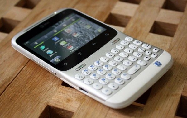
HTC kindly offered to lend us the HTC Status to have a look at and I was happy for the opportunity because it’s giving me some time to step back and look at Android on the lower-end of the phone spectrum. We tend to focus on the bleeding edge devices, and sometimes it’s easy to forget that not every person (in fact, the majority of people) don’t want to drop $299 on the latest phone every year. The HTC Status runs a cool $49 on contract which blows me away because this phone is pretty damn gorgeous.
The HTC Status is running Android 2.3 on a 2.6″ 480×320 (3:2) screen which is curious because this is the exact same resolution that the very first Android phone, the HTC G1 (AKA Dream), used. If you’ve read my analysis of the ergonomics of Android, you shouldn’t be surprised to find that, from an ergonomic standpoint, HTC is way easier to use with one hand. Instead of stretching and shuffling to read between the navigation buttons and the notification bar, it’s all right there, easily within reach.
The unfortunate fact is that almost all of today’s Android applications are designed with the assumption that the phone they will be used on is primarily portrait and with much more screen real estate. Despite how it may seem, I was actually really impressed with Android’s ability to scale everything down to the smaller landscape resolution of the HTC Status. Things are no doubt cramped at times, but the ability to adapt the entire interface, from something like the massive 5.3″ 1280×800 screen of the Samsung Galaxy Note to the relatively tiny 2.6″ 480×320 screen of the Status, is rather amazing.
HTC has never disappointed in the hardware department. Even though the Status will only run you $49 on contract, this hasn’t made any impact on the attention paid to the hardware. The Status feels great and I love the styling — it’s clean and sharp. The keys on the keyboard are firm and have near-perfect feedback when clicked.


 The
The