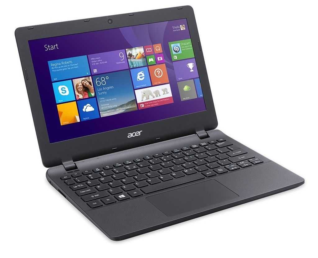
![]() Intel’s Ultrabook campaign is quite rapidly transforming what consumers can expect from a PC laptop. They’ve driven prices and weight down, and performance and features up. I’d argue that PC laptops are looking the best that they have in recent memory thanks to Intel’s Ultrabook project. But that’s just the hardware. On the software side, we’re still dealing with Windows and the same frustrations it’s shown us for several years now. Can Microsoft up the ante with Windows 8 to bring software quality in line with Ultrabook hardware? Read the full story
Intel’s Ultrabook campaign is quite rapidly transforming what consumers can expect from a PC laptop. They’ve driven prices and weight down, and performance and features up. I’d argue that PC laptops are looking the best that they have in recent memory thanks to Intel’s Ultrabook project. But that’s just the hardware. On the software side, we’re still dealing with Windows and the same frustrations it’s shown us for several years now. Can Microsoft up the ante with Windows 8 to bring software quality in line with Ultrabook hardware? Read the full story

Tag Archive | "Software"

Can Microsoft Do For Windows What Intel Has Done for the Laptop?
Posted on 22 May 2012

ThinkPad Tablet Productivity Apps and Digital Inking video
Posted on 20 October 2011

Heads up: this article spends some time talking through the use of tablets as productivity devices in general, and then some time discussing the features and functions of the ink apps that I use on a daily basis at work. For demos of the apps and discussion of how the Lenovo Thinkpad Tablet actually handles the apps, hit the videos at the end. Thanks.
This is my personal crusade. I take extreme umbrage to most of the media’s commentary that tablet’s are media consumption devices only and cannot be used effectively for productivity. Balderdash. This is commentary being championed by a community whose typical workflow does not mirror the vast majority of the rest of corporate America. As a tech journalist, yes, I agree, I cannot effectively use a tablet for the finishing work required to post an article. It is difficult for me to manage images and video and effectively upload those to the various content management systems (CMS) that I have to work in. Of course, that’s not to say it can’t be done; Chippy has figured a lot of that out and is somehow able to get a lot of his work on Carrypad and UMPCPortal done from his Galaxy Tab.
However, while images and video represent perhaps the most compelling components of our content, the fact remains that most of our content, and arguably the most valuable part, is the written word that we post. And for that, a tablet is certainly capable of handling that workload. In fact, I am starting this article on my ThinkPad Tablet, hooked up to a CP Technologies 4-port USB 2.0 hub, and a small form-factor keyboard and Gigaware USB mouse.
In my day job as an IT Project Manager and Systems Engineering Manager (doing double duty these days), I am able to do a great deal of my work on a tablet. Despite all of my opening bluster, I will admit that most of this is work that I do in Office applications. Drafting Software Development CONOPS, employee performance evaluations and notes, and just keeping track of my tasklists are some of the work objects that I easily juggle on a tablet.
As a PM, a lot of what I need to do is track everything that is going on on my projects, keep records of every design decision that I make with the various teams, and maintain technical journals of the progress of a given program’s design. I am also able to draft the initial versions of my Integrated Master Schedules using MS Project-like apps. In the technical realm, I am able to draft versions of initial software and systems architectures using mindmapping software that I use to replicate the intended SysML/UML structures and Functional Architectures that I design for the various systems and software applications. Pseduocode in text is also possible for framing my desires in initial design frameworks to hand-off to the programmers to then write the actual executable code.
There are a couple of things that doing this work offline on a tablet does that I count as big productivity advantages for me. One, it allows me to work off of my work-issued laptop and stay away from the distraction of emails coming in every minute. I realize that I could just close Outlook, which I do a lot when I am working on my work PC, but I will admit that my combination OCD/ADD keeps me from being as disciplined as I would like. Working offline on a separate machine just works better for me. Secondly, it allows me to work within my own personal information architecture, organizing specific topics, projects, and data types in specific applications.
One thing I hate about working on a pen-and-ink notebook is that when I flip open a notebook, the specific information I am looking for does not immediately jump out at me. I need color, tabs, folder structures, and so forth, that allow me to look at a page and immediately tab to what I need or want. Is working on a tablet a necessity? Not necessarily, although I will contend that in order for me to perform at my best, I must be on either a Windows TabletPC or a mobile OS tablet after ten years of working within this paradigm. Is my work tablet a toy? Absolutely not. I am not handing my ThinkPad Tablet (or any tablet other than may be my lowest-end, soon to be replaced tablet) over to my kid for anything. My ThinkPad Tablet is, at this point, an essential companion that is the focal point of my workflow. I do not go to a meeting without it, and if anyone walks into my office to start discussing something, I immediately reach for it to take notes.
My productivity apps break down into a set of keyboard apps and digital-ink apps. I will go over some of the keyboard apps in a later post where I will cover all areas of my productivity activities in both Android and iOS. Today’s focus is on the ink apps that I use on the Lenovo ThinkPad Tablet. As you likely know already if you have kept up with the first three entries in this series, the ThinkPad Tablet is one of just a few existing mobile OS tablets that sport an active digitizer. This allows digital ink input from the ThinkPad stylus, which can be purchased separately or as a bundled with all three models of the ThinkPad Tablet.
While some ink apps available from the Android Market specifically feature palm-rejection, it seems like this is an innate ability built into the ThinkPad Tablet. Whenever I use any app capable of ink, the only input that is picked up is the input from the stylus, for the most part. This feature does not function 100% perfectly all of the time; in the fraction of a second that my pen lifts from the screen, in some apps, my palm might get picked up. At its most benign, this results in a dot of ink that winds up somewhere I do not want it. In these cases, I typically just write over the dot when I get to that area of the page. Not an issue. In one app, the result is an angled line that chops across the page in the vicinity of my palm. These marks erase easily, and do not have a big enough impact that I am really slowed down to any significant degree. Again, it’s not perfect, but it is so much better than anything that I have seen on tablets while using a capacitive stylus that it is an acceptable trade-off.
Let me make one other mention. In Android in general, if you are going to use a tablet for business use, you have to be very selective about which apps you use and where you are going to entrust recording data. Apps will definitely flake-out and become unstable. This is even more prevalent in digital ink entry. Instead of starting off covering the apps that work well, let me highlight the apps you want to skip for digital ink.
First is the app I am writing in now using keyboard entry, Note Everything. While Note Everything has the capacity for supporting Paint Notes, and initial ink entry works well, storing and recalling the artifact is a roll of the dice. I was happy with the results, but when I went back to recall the notes, the middle of the ink page was justified all the way to the left, cutting off any ink that was written to the left of that point. Rotating the screen to landscape yielded the same results. Note Everything also does particularly poorly if you rotate in the middle of taking a Paint Note. Obviously you can understand why I would not want to entrust notes from an hour-long meeting to this app. The same is true in terms of reliability when using Extensive Notes. Ink notes will frequently be recalled as completely black images with no ink visible.
In addition to these two apps, there are several apps that render ink too thickly with little to no options to reduce the thickness of the ink line. A lot of them only allow you to write within a very constrained window where you can fit one or two words before the app wants to append those words to a separate image of the notes that it renders in a window above the writing area. Furthermore, there are several ink apps that are rendered for small-screen devices, so when the ink is displayed it is too small to be useful when you want to read the note.
Now on to the goodies:
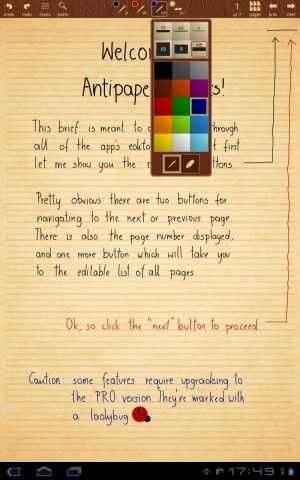
AntiPaper Notes HD: this app is the closest thing I have found to Penultimate, which is the best, and arguably the only, effective app I have been able to find for digital inking on iOS. You can create specific notebooks, and append titles and descriptions to the notebooks. They are displayed in a gallery from which you can select which one to work in. The app only renders in portrait view, which is a little annoying when I am working on a keyboard in landscape mode and just want to read my notes. Due to the overall performance of the app, I have accepted this trade-off as I typically ink in portrait anyway. There is a Pro version of the app supposedly under development, so there is a minimum of feature variety offered in the current version.
With AntiPaper Notes HD, you can ink in either red or black ink, and you can white out sections or erase them. You can create multiple pages in a notebook. There are four different paper options including Plain, Lined, Graph Paper, and Note, the latter of which provides 5 lines, then blank space, then 5 lines, and so on down the page, like a music style sheet. If I was still composing, I could see using this app to twiddle draft measures before I sat down on a keyboard. The notes can then be exported via the email function to a Bluetooth recipient, Google Docs, Dropbox, attached to an email as a JPEG, Evernote, Gmail, Note Everything, Picasa, PrinterShare, Springpad, or Twitter. Most of these options just allow you to send the page as an image. However, Evernote apparently has a plug-in called Skitch that appears to allow you to pick up inking within Evernote; I have not had a chance to experiment with this functionality. I am also not sure if this is a capability provided by Evernote or something special that Lenovo coordinated with Evernote. Sending the ink note to Note Everything gives you the option of embedding the image as a note, or appending a link to a page in a note. AntiPaper Notes HD tends to be my go-to app for taking notes in regularly scheduled meetings. I also scribble notes into a running tasklist notebook from emails, and, when I only have time to ink my daily schedule (I usually enter my daily meeting schedule into Jorte), I place it in a dedicated notebook in this app.
Notes Mobile: I should have mentioned at the outset a reminder that digital inkers tend to break down into two groups – those who must have handwriting recognition and those for whom it is a nicety. In the latter group, there is another sect for whom handwriting recognition does not mean a thing. Perhaps unfortunately for some readers, I am in this last group. I never use handwriting recognition, mainly because my penmanship is so poor. So for me, Notes Mobile is a completely serviceable app. It is a little sluggish opening notebooks, but other than that, it performs well.
Hopefully, this is something Lenovo can address in a software update as this is one of the pre-installed apps they provide with ThinkPad, sourced from a developer that only releases it to OEMs. If you need handwriting recognition, your mileage may vary. I have seen some other reviewers indicate that it works well. For me it works poorly, but then, my chicken scratch is barely recognizable to me, much less a computer. A lot of disinformation has gotten out on this app because most early reviewers did not understand that you can go into a mode that just lets you write or draw, without the app trying to convert your ink to text. This is the mode I always work in.
You can set up discrete notebooks, and you can just write the notebook name on the cover, or have your writing converted to text on the cover as well. The notebook covers can be set to different colors. The app has its own Palm Rejection setting, which zeroes out the few palm pick-ups that I experience in other apps. The Palm Rejection can even be set for those who are left-handed. It has a few options for font settings for converted text, and a few for setting the ink thickness. A little more variety is offered for ink color, where there are 9 options. This is another app that I sometimes use for meeting notes, but less than I use Antipaper Notes HD. I also enter my notes on personnel matters into this app for my employees. Notes Mobile is another tool that only renders in portrait orientation.

RepliGo Reader: This is an app that I have spent very little time with, so I cannot comment on it much. It is a PDF annotation app that allows you to write digital ink, append stickies, and other comments and notes to PDF documents. I frequently export web pages and Microsoft OneNote pages to PDF docs, dump them to my SD card that I use in the ThinkPad Tablet, and then open them up in RepliGo Reader to mark them up with notes in digital ink. I have not used it much because I just came up with this solution for marking up design notes that I originally create in MS OneNote and then need in meetings for discussion. As my teams work through a given problem, I mark up my OneNote artifacts in RepliGo. If I need to, I transfer them back to OneNote on my PC for further work back at my desk. Most of the time, leaving them in RepliGo is good enough. The small amount of experience I have had with the apps gives me a good deal of confidence in it as a long-term solution. RepliGo renders in both portrait and landscape orientation.
TabNotes: I love TabNotes. I tried it out on my Acer Iconia Tab A500 when I was using it for work and it did not engender itself to me using capacitive ink entry. But the app shines on the ThinkPad Tablet. It is very esoteric, and so figuring it out is a lot of trial and error. For the longest time I thought it was one of those apps that only allowed you to ink in an entry box, but it does allow you write freehand directly on the page, once you figure out which button across the top enables that mode. One of the big advantages is that you can both view and ink in the app in both portrait and landscape orientation. It is a bit slow to open and exit notebooks, more so than Notes Mobile.
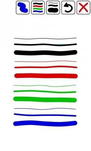
You can create new notebooks with eleven different notebook covers. The cover and pages are rendered in a deck of cards that slightly overlap each other. You cannot swipe between pages; if you want to go to another previously created page, you have to go back to the notebook view, and then enter the other page — a small annoyance. Once on the page, you can resize it using two fingers. There are 8 different pen colors, 6 different ink thicknesses, and eighteen different paper styles. Enough variety to keep my random mind from being bored. It only has hooks to export the pages to either a PDF document or a JPEG. It also has a line straightener if you are drawing shapes so that you can draw a line, hit the straightener, and it converts your line or multiple lines into a straight-edged shape. You can only freehand draw in this app; there are no options for entering text. I keep a lot of my time management notes in this app, as far as what tasks I want or need to spend time on in a given day or night.
Whiteboard Pro: This is another one of my favorites because you can append multiple whiteboards as widgets to your homescreens. I keep a homepage that has four Whiteboard Notes in each quadrant of the screen. This app will do both portrait and landscape, but you have to pick one or the other at any given time; you are then locked in that orientation unless you enter the Configure dialog and change it. It has several pre-defined colors for markers, as well as colors for the individual boards. You can also select the color and thickness of the board borders.
Stability is a mixed bag. If you jump out of a new note that you have started, you might lose the first few lines. This app works best if you open up a marker note and ink in it for a while before you try task-switching to another app. It also has a bug where you may not see your ink note rendered when you get out and go back to the home screen initially. I frequently go back to a blank widget, with the ink rendering on the widget a few seconds later or after I swipe to another homescreen and back again. Still, its utility is in surfacing notes directly on your homescreen without having to go into the app. It takes a little time to get accustomed to the understanding that it is not a persistent app like some of the notebook-oriented apps. Each instance of a Whiteboard is its own object that runs independently, so when you enter a Whiteboard space, you only have access to that Whiteboard until you exit and then select another Whiteboard widget.
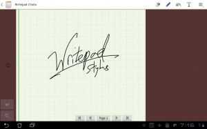
WritePad Stylus: Another close favorite. This is the app I reach for when people walk in and start an unannounced pop quiz. Individual note pads are available on the main screen, and each notepad has its own pages. I tend not to use this as a subject oriented app as it does not feel intuitively like a notebook app to me. I tend to scribble instance, no-notice topics in here that I expect to be short lived. You can title each notepad individually from the home page, which resembles a cork board. There are 3 ink colors, 3 ink thicknesses, and four types of paper. You can turn a note into a read-only note. You can import images for markup, as well as web pages. You can share the page with the same apps as you can with Antipaper Notes HD, or export the entire notepad, although I did experience a lockup after trying this a few times. As far as I could tell before experiencing the lockup, the options for exporting the whole notebook are fewer than just exporting the page itself. There is a separate option for exporting the page as a PDF.
My time with the Lenovo ThinkPad Tablet has been a joy, and I expect it be my work companion device for a long time to come. Unfortunately, it is not as stable as the Acer Iconia Tab A500. I keep the Manage Applications widget on my homescreen so that I can kill nasty apps that get stubborn, and digital inking seems to raise the frequency of these events. It helps that the recent apps menu in the lower left-corner of the Honeycomb screen also allows you to kill apps directly from there. I have seen other reviews where the ThinkPad Tablet has benched better than the Samsung Galaxy Tab 10.1, but real-world perception counts for more than any benchmark, and I feel like the ThinkPad Tablet is not as fast as the Motorola Xoom or the Acer Iconia Tab A500. But I also do far more on my ThinkPad Tablet than on either of those devices. And the speed of digital inking over keyboard entry is a strong pillar of my personal workflow.
I know I spent a lot of time on the functions and features of my personal app set of ink apps. For some insight into how the apps perform, please take a look at the videos below. They are long, but I wanted to ensure that I spent enough time demonstrating the apps so you could get a feel for how they work.
Note: the original video I shot had the tablet off-camera, so I recorded this shorter version. The longer version of the video is being uploaded now and will be available later today. It highlights some additional points that I did not have time to cover in the shorter version.
Think You Know Everything About iOS? Test Your Mettle Against These 13 iOS 5 Tips/Tricks
Posted on 14 October 2011
 iOS 5 launched on the 12th, and new iPhone 4S owners will be greeted with Apple latest OS when they receive their phones today. I’ve seen far too many “iOS 5 Tips/Tricks!” articles today that feature nothing but obvious things like “you can tweet stuff!” or “look there’s a notification center!”. So I’ve compiled a list of some actual iOS 5 tips and tricks, and I’m hoping that at least one of these is brand new to you. Most of these are iOS 5 specific, a few are oldies, but hopefully still new to you. Check it:
- Open in background in Safari — though I’m still annoyed that Apple only brought tabbed browsing to iPads running iOS 5, leaving the iPhone and iPod Touch out in the rain, they fixed one of my major browser annoyances by allowing you to open pages behind the one you’re currently viewing. Annoying, you need to enable this through the Settings app, but it’s there none the less. To turn it on, go to Settings > Safari > Open Links > select ‘In Background’. Now when you go into Safari, you can hold down on a link to get a list of options, one of which is ‘Open in Background’. Click it and you’ll see the link jump into the window button, and it’ll open in the background without making you watch that slow window-opening animation!
- Private Browsing in Safari — It isn’t hard to theorize why Apple didn’t parade this option around when they unveiled iOS 5, but you can enter into a ‘Private Browsing’ mode in Safari, for whatever your purposes might be. Again, this is annoyingly activated through settings, instead of being easily toggled from within Safari itself. To turn it on, go to Settings > Safari > and flip the ‘Private Browsing Switch’. When you toggle this switch, you’ll be prompted to keep all existing windows or close them.
- Use the Flash LED as a Notification Light — I’ve always enjoyed testing Android devices that have notification LEDs because with my iPhone, I’m constantly flicking the screen on to check for new notifications. Of course, Apple will probably never add a flashing notification LED because they probably wouldn’t think it pretty enough for their precious iPhone. If they ever add such an LED, you can bet your bottom dollar that it’ll pulse gently, not flash. It’s an Apple thing. And because Apple is… Apple, I was surprised to find that they added the option in iOS 5 to use the camera’s LED flash as a notification light. It isn’t exactly as it seems though… Apple added this as an ‘Accesibility’ option, an effort to help disabled people use their devices more easily. But hey, that won’t stop you from using this feature. To turn it on go to Settings > General > Accessibility > and turn on the ‘LED Flash for Alerts’ option.
- Week View in Calendar — This one is downright confusing, and there’s no one to blame but Apple. By default, across the bottom of the Calendar application, you can see the options to switch between the List, Day, and Month views. As of iOS 5, you can rotate your device and see your schedule in a Weekly view. Pretty neat, but unnecessarily hidden if you ask me.
- Hourly View in Weather — Also an iOS 5 addition, you can now get by-the hour weather for the current day from the native Weather app. Go into the weather app and tap anywhere on the current weather card. You’ll see the ‘Hourly’ text under the location name light up, and you’ll get the view of 12 hours of upcoming weather for that location.
- See Specific Stock Prices in the Stocks App — If you’re a serious investor, I’m doubting that you’re using the native Stocks app, but if you’re a weekend trader, it might get you by. I’m actually not sure if this is an iOS 5 addition, but it’s handy none the less. Go into the Stocks app, rotate to landscape view to get a larger graph, then run your finger along the grab. You’ll be able to see specific prices for that stock at any point along the graph. The Stocks app also updates live now, so you can watch the price as the trading day progresses. Don’t forget that you can swipe between your stocks while in the large-graph view.
- Print Map Directions — Sometimes, having a backup paper map will save you from the dreaded dead battery situation. In iOS 5, you can now print directions from the Maps application which is pretty cool if you’re configured an AirPrint printer. To print directions, go to the Maps app, get yourself some directions (or as Siri to do it) then hit the ‘peel’ button at the bottom right corner of the app. The map will peel away, revealing some additional options, one of which is Print. From there, you can specify how many copies you want, and which printer you want to print to.
- Put Newsstand into a Folder — If you have no use for the new Newsstand app that comes along with iOS 5 and are annoyed that you can delete it like other apps, it has been discovered that you can actually trick it into going into a folder. To accomplish this, start with any 2 apps on the home screen (make sure Newsstand is on the same page. Hold down on one of the apps to get them to wiggle. Drag either of the two apps onto the other and drop it. A folder will be created, and right after you drop one app on top of the other, drag Newsstand into the folder. If you time it right, it’ll slide right in, like a good app. Do not click on Newsstand when it’s in a folder, it will cause your Springboard (technical name for the home screen environment) to crash. This isn’t a big deal as it will restart momentarily, but it’s not something you want to happen if you’re in the middle of something important. The source of this solution appears to be from Coding Massacre, so credit to them! I can only hope Apple doesn’t fix this bug with a later update to iOS 5, because I’m doubting I’ll use Newsstand at all.
- Send More Than One Photo at a Time Through SMS or iMessage — This isn’t new to iOS 5, but it’ll be even more handy now that the messages will start flying with iMessage, which did indeed come along with iOS 5 (it also works with SMS and email). If you try to attach a photo to an SMS or iMessage, you have to select them one at a time. If you want to send a bunch at once, launch your Photos app, hit the square/arrow button at the top right after going into an album, select the photos you want, then hit Share, then Message at the bottom. Now you can enter your friends name at the top to send via SMS or iMessage (or hit the email option instead of message to send by email).
- Minimize the Keyboard in the Messages App — Apple finally gave us a way to minimize the keyboard in the Messages app as of iOS 5. Prior to the update, you couldn’t minimize the keyboard once you brought it up (this doesn’t apply to iPad users as they have a minimize keyboard button on every app!). Now when you go to scroll up to read previous parts of a conversation, the keyboard will minimize automatically. Thanks Apple… it’s about time.
- Create New Calendars and Photo Albums on Your Device — Now that Apple has ‘cut the cord’, allowing iOS 5 (and beyond) devices to run without the need of a computer, they’ve tried to move some of the computer stuff onto the device. Now you can create calendars directly on the device (which will be synced to iCloud), and you can make your own Photo albums, which was always a pain to have to do through the computer. Photo Albums are a bit iffy as you can’t put a photo in an album then delete it from your camera roll. If you do try to delete it from the camera roll, it’ll be deleted out of the album too. I suppose this will be handy for people who use AirPlay to show slideshows on their TV. To make a new calendar, go into the Calendar app and hit the ‘Calendars’ button at the top left. Then press the ‘Edit’ button, also at the top left. Now you’ll find the ‘Add Calendar…’ option in the iCloud section. If you can’t see this option, you probably don’t have iCloud enabled (you can do this through your Settings app). To create a photo album, go into the Photos app. Go to the Albums view and press the ‘Edit’ button at the top right. On the left, you’ll see an ‘Add’ button and which will prompt you to give your new album a name, then ask you to add photos to it.
- Album Art Swipe Gesture — This is one of the least known iOS tips I know of. I came across it completely by accident. It’s existed long before iOS 5. I may have discovered it back when I got the first-gen iPod Touch (yeah, like pre-App Store). It’s really not that useful, and you wouldn’t think it would be used that often, but for some reason I seem to use it all the time when navigating my music library. If you’re in the Music app on the Now Playing screen (you’ll see album art and play/pause controls at the bottom), instead of pressing the little arrow at the top left of the screen to go back to the library view, you can swipe to the left on the album cover and it’ll take you back to library view. Again, this isn’t anything revolutionary, but it’s so strangely hidden that I wonder if Apple even remembers that it’s there. Whatever the case, I use this gesture every time instead of hitting that little arrow button.
- Change Font in Notes — I don’t tend to worry too much about fonts, but if you’re a font fiend like my pal Dante Cesa from Engadget, this may be of interest. You can toggle through a whopping three different fonts for use in the native Notes app. With a whole three to choose from, I know you might just lose your mind trying to decide, but hey, you can always flip a coin or something. I think I’ll go with Helvetica.
So there you have it folks, 13 fine iOS tips, many of which are new to iOS 5. So how did I do, did I manage to stump you on a tips you didn’t know about prior? Or do you have some incredibly unknown iOS or iOS 5 tip that you want to share? Drop a line in the comments!
New Disappointing Details About Playbook ‘Android Player’ — As if the Delays Weren’t Disappointing Enough Already
Posted on 29 September 2011
 Remember the Blackberry PlayBook? Yeah well, prior to it’s release way back in April, RIM spilled the beans on what seemed like a really neat feature… the ability to run Android applications on the device thanks to an application called the Android Player. We covered a demo of this functionality that RIM showed during Blackberry World back in May, and we were genuinely impressed with how it seemed to work.
Some 5 months after the launch of the Blackberry PlayBook, not only has the Android Player not even been released, but new details tell us that it’s going to be much less impressive than we were initially led to believe.
Dante Cesa of Engadget points out a story from Thinq with new details about the Android Player. Specifically, the Blackberry PlayBook won’t be able to run any applications that have been developed with the Native Development Kit. There are no official figures on how many applications use the NDK, but it’s likely that a decent amount going by Google’s description of the tool: “The Android NDK is a companion tool to the Android SDK that lets you build performance-critical portions of your apps in native code. It provides headers and libraries that allow you to build activities, handle user input, use hardware sensors, access application resources, and more, when programming in C or C++”
Not only are NDK-built applications off-limits for the Blackberry Playbook’s Android Player, but so are any applications which rely on Google Maps, text-to-speech, in-app purchases, or the cloud-to-device messaging system that you’ve seen used with Google’s Chrome to Phone extension.
Blackberry’s PlayBook launched to much fanfare, but was cut down pretty quickly by reviewers for having missing features… you know, like an email client. After failing to gain much traction, thoughts of RIM exiting the tablet market are starting to crop up, definitely not a good sign for a company that is already widely regarded as behind the times in its once thriving smartphone lineup.
Everything You Need to Know About the Windows Phone 7.5 Mango Update
Posted on 27 September 2011

Windows Phone 7.5 (AKA Mango) has been previewed by Microsoft for months now. Numerous bloggers have been given access to early builds of it, and it’s been pretty much revealed from head to toe… or so we thought.
Today, Microsoft is officially announcing the rollout of Windows Phone 7.5. Along with that announcement comes the reveal of tethering functionality and a browser-based version of the application store which will offer an easy way to peruse the application store on a computer, much like https://market.android.com/.
Microsoft tells us that Mango updates began this morning around 10AM PST. The process is beginning gradually and will slowly ramp up — they hope to have the update available to most existing customers within 4 weeks. The update is being deployed globally, across all carriers and phones. They say that 98% of existing Windows Phone 7 devices will have access to the update when all is said and done. Kudos to Microsoft for getting the update to nearly all devices, rather than just to a specific carrier or specific phone before everyone else (*cough*Google/Android*cough*).
If you want to find out where your update is, Microsoft has a page which will give you some detail as to the status of the update for your particular carrier. If you’re on a US carrier, you’ll want to check here. International folks should give this link a try for Windows Phone 7.5 Mango update status. You’ll receive a message on your phone when the update is ready, and you’ll need to plug it into your computer for the update to commence. If you don’t already have the Zune software, or Windows Phone 7 Connector (OSX) installed, you’ll want to do that as they are required for update instillation.
If you’re looking for a final list of what will be included in the Mango update, Microsoft has a fairly extensive list of features that you’ll find in Windows Phone 7.5. If you’re a new customer and considering a Windows Phone 7.5 device, take a look at Engadget’s exhaustive review.
As mentioned, previously not revealed facets of Windows Phone 7.5 include tethering functionality and a web version of the App Marketplace. Reports indicate that tethering will only be coming to new phones with Mango installed; it’s unclear whether or not this is a software or hardware problem (my vote is on the former). The web Marketplace is already available for browsing and is part for the course — offering ratings, screenshots, top app lists, and the ability to download apps to your phone wirelessly, thanks to your phone’s association with your Windows Live account.

There IS Innovation in the Tablet Market; Even if There Wasn’t, Grid is Not the Answer
Posted on 17 August 2011
 Yesterday the company behind the infamous Joojoo, Fusion Garage, revealed itself as the real name behind the fake company TabCo which had been teasing the tech world for the last few weeks about an upcoming tablet.
During the announcement webcast, Fusion Garage did indeed reveal a new tablet which turned out to be the Grid 10 device that we saw pass through the FCC a few weeks back (though at the time we didn’t know it had anything to do with TabCo). You can find full specs, links, photos, and more at the Grid 10 tracking page in our mobile device database.
In a genuine surprise, Fusion Garage released not only the Grid 10, but also a smartphone called the Grid 4. The Grid 4 is quite thin at 9.6mm. You can also find full specs and plenty more for the Grid 4 in our database.
Both of these devices run Fusion Garage’s own ‘Grid’ OS which is not Android, but is based on the Android kernel. Grid will be able to run Android applications natively, but neither of the devices will have official access to the Android Market, nor will they have the usual Google applications that you find on an Android device, like YouTube, Gmail, Maps, etc. To compensate for this, both will come pre-installed with the Amazon App Store as well as Fusion Garage’s own Grid application store.
Devices aside, I can’t help but comment on some of the remarks that Fusion Garage made during their webcast.
According to Fusion Garage’s CEO, Chandra Rathakrishna, Apple’s iPad is the only real tablet in town, while Android tablets offer nothing but “parody inch. Specifically, Chandra said that there is no innovation in the Android tablet market and that companies out there are offering nothing but sameness. He also went on record as saying that Fusion Garage would change that, that the market needs a “shakeout inch.
I have to wholeheartedly disagree with Chandra’s remarks. Not only is there innovation in the Android tablet market, but even if there wasn’t, Grid is not the answer.
If anything, Apple has been the stagnant one in the tablet field thus far. Sure, they may have arguably started the market, but they’ve added very little to their initial iPad offering. Don’t get me wrong, the iPad is certainly a good product, but between the iPad and iPad 2, there isn’t much except for an increase in speed, reduction of weight and girth, and some cameras. That’s not innovation, it’s just improving on what’s already there.
Meanwhile, some rather brave companies have been experimenting in the Android tablet field with features and functions that Apple simply doesn’t offer with the iPad at this point.
Look at Asus. Their Eee Pad Transformer, which docks to a keyboard and can then be folded closed like a netbook, has been very well received in the market, and is empowering people to use their tablet in situations where they otherwise wouldn’t. They’ve also got that excellent looking Eee Pad Slider launching soon, which keeps the keyboard hidden away under the screen when you don’t want it, and they’ve thrown in a full-sized USB port for connecting useful peripherals like a flash drive or mouse.
And it doesn’t stop there.
Have a look at the HTC Flyer, the first Android tablet equipped with an active digitizer for serious digital inking. Then there’s the ThinkPad Tablet which seems to combine functions of the Transformer with the Flyer by offering a dockable folio with full keyboard and mouse, which folds down like a netbook, as well as an active digitizer for digital inking and notetaking.
Not to say that these devices have been or will be smash hits, but these companies are experimenting and innovating, and producing devices that are all stepping stones toward more productive and useful devices that can be used in scenarios where the iPad (and the Grid 10 for that matter) cannot.
I hate to put down Fusion Garage; they’re a company of around only 100 people, and have limited funding compared to the likes of Apple and Google. I appreciate their vision, but I don’t think they’ve been realistic about what they can accomplish.
In the webcast, they offered their Grid OS as the cure to their perceived sense of sameness that they say is found in the Android tablet market, but from their own demonstrations, they’ve done nothing but offer up different (not new) ways of doing the same old things.
During their demonstration of the Grid OS, I saw lots of eye-candy and even some cool visual design, but little in the way of intuitiveness. The home screen, for instance, works like a big open canvas where you can place all of your apps. The area is so far zoomed in that there is actually a map at the top right of the screen to indicate where you are on the home screen. I’m sorry Fusion Garage, but if the homescreen of your device requires a map to be used effectively, you’ve failed on ease-of-use:

I hesitate to even start talking about the “3D tilt inch that they’re so proud of. They’ve got this scrolling animation that slightly tilts the list that you’re scrolling through. Listen to how they laud it on their site without even saying how it’s beneficial:
“Scroll your contacts quickly with a 3D tilt. Find your contacts quickly and easily. inch
“Have a big video collection? Scroll through it quickly with Grid10’s 3D tilt. Scrolling through your collection has never looked better. inch
I’m sorry FG, but tilting the thumbnails on a list by 5 degrees or so as I scroll doesn’t not make my movie collection look any better than if it just scrolled with no tilting.
The problem with “3D tilt inch is that it does nothing but distract visually. It doesn’t help you find anything in the list any easier than if it didn’t tilt. It isn’t even there to indicate the direction of motion as that’s already accomplished with a non-tilting scrolling list. It’s pure eye-candy, and I’ve got a major problem with that. It’s like giving a race car curves to make it look cool instead of being aerodynamic — it’s flair with no function. You can see their silly 3D tilt effect here (and notice how you’re never really certain what part of the interface is going to pop our of where lack of intuitiveness!):
Then there’s their video controls that we “haven’t seen anything like inch which are just your basic video controls, which they managed to make more intrusive than putting the seek bar across the top or bottom of the screen like everyone else:

The Grid interface isn’t the only thing with needless eye-candy. Fusion Garage’s entire presentation showed me little but wasted money. A small company doesn’t need to put on a big press event and parade around with an Apple costume on people get this. But here is Fusion Garage, wasting money by building a big stage with moving parts for a virtual audience, and trying desperately to be like Apple or Google, even if people wouldn’t mind if they were just themselves.
I actually chortled to myself when they announced Grid; lights flared, and a big metal lattice with some squares bearing the “Grid inch name lazily slid in from both sides of the stage. Once they stopped moving, Chandra said “So people, there you have it, Grid. inch Much like 3D tilt, this was just eye-candy for the sake of it. There was absolutely no reason to waste money on fabricating and moving the stage like that. You can see the laughable spectacle here. I dare not even get started talking about the dub-step….
All the while, on the screen behind Chandra, you could watch a bunch of unnecessarily animated (and visually distracting *cough*3D tilt*cough) slides playing. Waste waste waste. Save that money and put it toward HCI testing.
The Grid OS showcases no new ideas but instead is just a whole new unintuitive operating system that they’re asking people to learn from the ground up. Not only that, but Grid brings along with it the disadvantage of not having official Android Market access, and missing out on some of the key apps that make the Android platform so useful. The ability to run Android apps natively is merely a crutch, as they won’t share the same interface design as the core Grid apps and those from the Grid application store.
Fusion Garage has not demonstrated anything revolutionary or innovative that I’ve seen. They’ve only introduced different ways to do things that we already do without issue on other mobile operating systems.
The Grid 10 is what the Joojoo should have been an impressive product, for a small company, but nothing that’s going to take off.
There IS Innovation in the Tablet Market; Even if There Wasn’t, Grid is Not the Answer
Posted on 17 August 2011
Yesterday the company behind the infamous Joojoo, Fusion Garage, revealed itself as the real name behind the fake company TabCo which had been teasing the tech world for the last few weeks about an upcoming tablet.
During the announcement webcast, Fusion Garage did indeed reveal a new tablet which turned out to be the Grid 10 device that we saw pass through the FCC a few weeks back (though at the time we didn’t know it had anything to do with TabCo). You can find full specs, links, photos, and more at the Grid 10 tracking page in our mobile device database.
In a genuine surprise, Fusion Garage released not only the Grid 10, but also a smartphone called the Grid 4. The Grid 4 is quite thin at 9.6mm. You can also find full specs and plenty more for the Grid 4 in our database.
Both of these devices run Fusion Garage’s own ‘Grid’ OS which is not Android, but is based on the Android kernel. Grid will be able to run Android applications natively, but neither of the devices will have official access to the Android Market, nor will they have the usual Google applications that you find on an Android device, like YouTube, Gmail, Maps, etc. To compensate for this, both will come pre-installed with the Amazon App Store as well as Fusion Garage’s own Grid application store.
Devices aside, I can’t help but comment on some of the remarks that Fusion Garage made during their webcast.
According to Fusion Garage’s CEO, Chandra Rathakrishna, Apple’s iPad is the only real tablet in town, while Android tablets offer nothing but “parody”. Specifically, Chandra said that there is no innovation in the Android tablet market and that companies out there are offering nothing but sameness. He also went on record as saying that Fusion Garage would change that, that the market needs a “shakeout”.
I have to wholeheartedly disagree with Chandra’s remarks. Not only is there innovation in the Android tablet market, but even if there wasn’t, Grid is not the answer.
If anything, Apple has been the stagnant one in the tablet field thus far. Sure, they may have arguably started the market, but they’ve added very little to their initial iPad offering. Don’t get me wrong, the iPad is certainly a good product, but between the iPad and iPad 2, there isn’t much except for an increase in speed, reduction of weight and girth, and some cameras. That’s not innovation, it’s just improving on what’s already there.
Meanwhile, some rather brave companies have been experimenting in the Android tablet field with features and functions that Apple simply doesn’t offer with the iPad at this point.
Look at Asus. Their Eee Pad Transformer, which docks to a keyboard and can then be folded closed like a netbook, has been very well received in the market, and is empowering people to use their tablet in situations where they otherwise wouldn’t. They’ve also got that excellent looking Eee Pad Slider launching soon, which keeps the keyboard hidden away under the screen when you don’t want it, and they’ve thrown in a full-sized USB port for connecting useful peripherals like a flash drive or mouse.
And it doesn’t stop there.
Have a look at the HTC Flyer, the first Android tablet equipped with an active digitizer for serious digital inking. Then there’s the ThinkPad Tablet which seems to combine functions of the Transformer with the Flyer by offering a dockable folio with full keyboard and mouse, which folds down like a netbook, as well as an active digitizer for digital inking and notetaking.
Not to say that these devices have been or will be smash hits, but these companies are experimenting and innovating, and producing devices that are all stepping stones toward more productive and useful devices that can be used in scenarios where the iPad (and the Grid 10 for that matter) cannot.
I hate to put down Fusion Garage; they’re a company of around only 100 people, and have limited funding compared to the likes of Apple and Google. I appreciate their vision, but I don’t think they’ve been realistic about what they can accomplish.
In the webcast, they offered their Grid OS as the cure to their perceived sense of sameness that they say is found in the Android tablet market, but from their own demonstrations, they’ve done nothing but offer up different (not new) ways of doing the same old things.
During their demonstration of the Grid OS, I saw lots of eye-candy and even some cool visual design, but little in the way of intuitiveness. The home screen, for instance, works like a big open canvas where you can place all of your apps. The area is so far zoomed in that there is actually a map at the top right of the screen to indicate where you are on the home screen. I’m sorry Fusion Garage, but if the homescreen of your device requires a map to be used effectively, you’ve failed on ease-of-use:
I hesitate to even start talking about the “3D tilt” that they’re so proud of. They’ve got this scrolling animation that slightly tilts the list that you’re scrolling through. Listen to how they laud it on their site without even saying how it’s beneficial:
“Scroll your contacts quickly with a 3D tilt. Find your contacts quickly and easily.”
“Have a big video collection? Scroll through it quickly with Grid10’s 3D tilt. Scrolling through your collection has never looked better.”
I’m sorry FG, but tilting the thumbnails on a list by 5 degrees or so as I scroll doesn’t not make my movie collection look any better than if it just scrolled with no tilting.
The problem with “3D tilt” is that it does nothing but distract visually. It doesn’t help you find anything in the list any easier than if it didn’t tilt. It isn’t even there to indicate the direction of motion as that’s already accomplished with a non-tilting scrolling list. It’s pure eye-candy, and I’ve got a major problem with that. It’s like giving a race car curves to make it look cool instead of being aerodynamic — it’s flair with no function. You can see their silly 3D tilt effect here (and notice how you’re never really certain what part of the interface is going to pop our of where – lack of intuitiveness!):
Then there’s their video controls that we “haven’t seen anything like” which are just your basic video controls, which they managed to make more intrusive than putting the seek bar across the top or bottom of the screen like everyone else:
The Grid interface isn’t the only thing with needless eye-candy. Fusion Garage’s entire presentation showed me little but wasted money. A small company doesn’t need to put on a big press event and parade around with an Apple costume on – people get this. But here is Fusion Garage, wasting money by building a big stage with moving parts for a virtual audience, and trying desperately to be like Apple or Google, even if people wouldn’t mind if they were just themselves.
I actually chortled to myself when they announced Grid; lights flared, and a big metal lattice with some squares bearing the “Grid” name lazily slid in from both sides of the stage. Once they stopped moving, Chandra said “So people, there you have it, Grid.” Much like 3D tilt, this was just eye-candy for the sake of it. There was absolutely no reason to waste money on fabricating and moving the stage like that. You can see the laughable spectacle here. I dare not even get started talking about the dub-step….
All the while, on the screen behind Chandra, you could watch a bunch of unnecessarily animated (and visually distracting *cough*3D tilt*cough) slides playing. Waste waste waste. Save that money and put it toward HCI testing.
The Grid OS showcases no new ideas but instead is just a whole new unintuitive operating system that they’re asking people to learn from the ground up. Not only that, but Grid brings along with it the disadvantage of not having official Android Market access, and missing out on some of the key apps that make the Android platform so useful. The ability to run Android apps natively is merely a crutch, as they won’t share the same interface design as the core Grid apps and those from the Grid application store.
Fusion Garage has not demonstrated anything revolutionary or innovative that I’ve seen. They’ve only introduced different ways to do things that we already do without issue on other mobile operating systems.
The Grid 10 is what the Joojoo should have been – an impressive product, for a small company, but nothing that’s going to take off.

WiFi-only Dell Streak 7 to Receive Honeycomb Update, 3G/4G Variant Being Left Behind with Android 2.2
Posted on 11 August 2011
 According to our pal Jenn over at StreakSmart, the WiFi-only version of the Dell Streak 7 is set to receive an official update to Honeycomb next month.
Details haven’t emerged yet, such as which specific version of Honeycomb will be used and whether or not it will be customized or left stock. Jenn says the the update is expected to greatly increase the battery life of the device.
This is great news for Streak 7 owners, but it only applies to the WiFi-only version of the device. Apparently T-Mobile’s 3G/4G variant, which StreakSmart points out was recently discontinued, may never receive the update.
An alternative option to acquire Honeycomb is a custom ROM which is an unofficial software release that can be installed to your device if you’ve got the skills necessary. Jenn has a link to that ROM on her original post, go check it out.
Are you a WiFi-only Streak 7 user who’s excited for the Honeycomb Upgrade? Or perhaps a T-Mobiler who’s angry that your device wont be updated? Let us know in our Streak 7 forum.


 |
| |||
 |
| |||
 |
| |||
 |
| |||
 |
| |||
 |
| |||
 |
| |||
 |
| |||
 |
| |||
 |
|