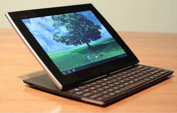
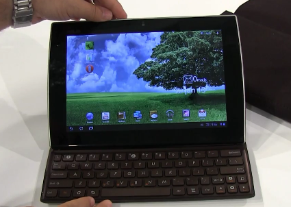
Over at Ritchie’s Room, Ritchie has gotten his hands on a retail version of the much anticipated Asus Eee Pad Slider and has given us a great preview of the sliding Honeycomb tablet.
A few bits to take away from the reading:
Sliding mechanism works well (kudos to Asus for this)
Tilt of the screen cannot be adjusted (kudos revoked!)
On the topic of the lack of mouse/trackpad: “proximity of the screen in comparison to the edge of the keyboard actually lends itself to retaining the touch interaction inch
The sliding function works well as a stand, even if you aren’t typing
If I were in the market for a tablet, the Slider would be a serious contender. Is it just me or does this thing seriously sleek looking? My only reservations are the lack of integrated trackpad or some other type of mouse, and the single USB port, though I could always add a USB hub if I wanted. The bezel is also a bit meaty, but I’m impressed with how thin they were able to keep it, despite the slide-out keyboard!
There’s more info to be found at the original post, including a brief rundown of some of the apps/services that the Slider will come with, and plenty of great photos. Be sure to check it out!
As for availability and pricing, at least one site claims that Asus Netherlands will be pricing the 32GB Eee Pad Slider at a rather hefty 499 euros ($711 USD) and that the device will be available in early 2012. The price may quickly come down however, and seeing how the Slider just made its way through the FCC, perhaps it’ll hit in the US a bit earlier than 2012? We’ll just have to wait and see!
Brad Linder of Liliputing points out a lengthy hands-on video of the Slider that recently went up on YouTube. I must say that the video only makes me more excited… the device looks really well built and the sliding mechanism seems to work great!
The only thing I’m not happy to see is that there is no mouse! I feel like Asus could have easily put a nub-mouse or optical mouse on the device and that would save people from having to use the only USB port on the Slider for an external mouse.
It has been 3 working days since I started my self-initiated challenge to have my Iconia A500 replace my HP 2730p at work. It took the first day to get it set up and configured, and a second day that I was out sick to really solidify how I was going to run the Acer for the foreseeable future. In that time, I have downloaded and applied the step up to Android 3.1 (the Iconia came stock with 3.0). I have also tested several functions of the various ports. I thought it would be a good time to give a brief synopsis of the story so far. Please note that some of the Carrypad crew have performed these tests in the past, so this is a refresher and a specific update as to how it all appears to be working under Android 3.1. Some of the notes will also reflect my specific perspective from attempting to use the A500 in the enterprise space.
Configuration and Apps: A few notes on my current configurations and why they are what they are for using a tab in the workplace
Homescreens and Calendar: I run fewer apps on the Iconia than I normally do on an Android device. While I use only one homescreen on my iPad, with all apps sorted into folders, and run almost all Widgets on Android homescreens, I have gone back to the function-specific homescreen paradigm on the Iconia. My main page has all of my productivity apps, the Advanced Task Killer widget, and my Calendar widget, which I have sized to its maximum size. I originally thought I would not use the “Iconia Tab” default account that comes already set up in calendar. But because I want to limit the amount of cloud syncing that occurs on this device, I have used this account to enter my daily work meetings. I then keep the calendar view suppressed to only the Iconia Tab account during the work-day, so I am not distracted by future Google appointments from my main account that is also synced with the device.
I keep one homepage for nothing but stickies and Whiteboard Pro tiles. The left-most homescreen has buttons for my weather apps and the Browser widget. These are so I can check weather before my commute home or on travel, and to quickly check tech news over my lunch break. The right-hand homescreen has any media apps that I use to assist me at work: Camera (for taking snaps of whiteboard exercises), Gallery (for viewing those snaps), Music (to work to), Recorder and Voice Recorder (for taking voice memos for myself). This screen also has MailDroid and GMail for checking personal mail over lunch.
The right-most homescreen has all of my admin utilities. ES File Explorer, the Android Market, JuicePlotter, Battery Dr, and Settings shortcuts for Bluetooth, Display Settings, Sound, and Wi-Fi.
I primarily run this device disconnected at work. I boot my hotspot upon arrival, again over lunch, and maybe right before leaving in the evening for a quick connection, minimal sync, and personal email check. Other than that, I keep Wi-Fi off.
Port Testing and Peripherals: While not all of this has an impact on my use of the Iconia A500 at work, I wanted to note the results of various hook ups I have attempted during initial setup.
USB Hubs: every USB 2.0 hub I have tried so far has worked. I have tried USB keyboards, mice, and thumb drives plugged into these hubs and have successfully connected and utilized each. The largest thumb drive that I tested was a PNY 32GB thumb drive. The one USB 1.1 hub that I tried did not work at all, leading me to believe that the Iconia’s full-sized USB port is only compatible with USB 2.0 hubs
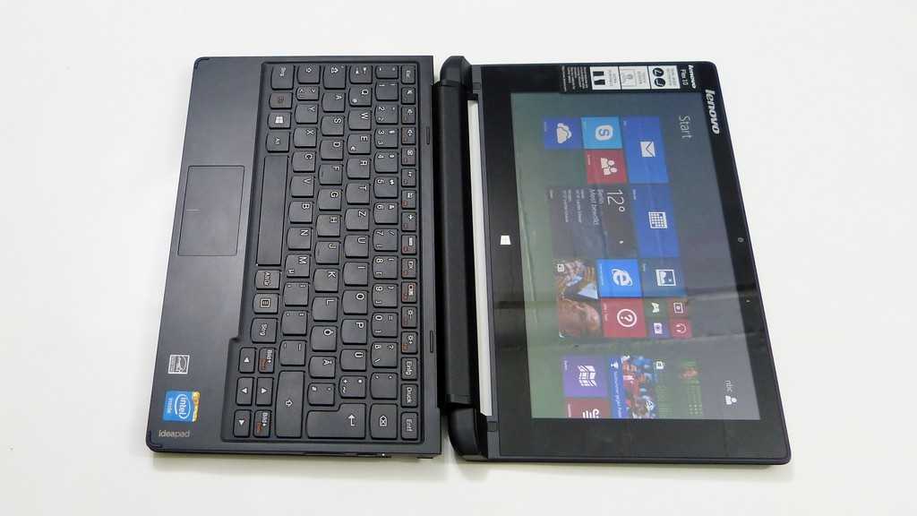
Keyboards and mice: I have tried several USB keyboards and mice with the Iconia and each one has worked. I have used a TabletKiosk Foldable Keyboard (pictured below), and an i-Rocks keyboard successfully. I have used several mice, including a Logitech G5 and they have all worked. I only tried using the left and right mouse keys, and have not tried the scroll-wheel button or the forward and back buttons. The scroll wheel itself does work in most apps to scroll through the page.
TabletKiosk USB mini-keyboard – no longer for sale through TabletKiosk
Thumb Drives: another round of completely successful tries. I have tried the aforementioned PNY 32GB drive, as well as two 4GB drives
MicroSD Cards: All successful. I used a 4GB and a 16GB card. Both cards were wiped and formatted to FAT32 file systems. With both of these, as well as the thumb drives, I was able to use ES File Explorer to access the contents. I was able to access Word, Excel, .PDF, and image files. It is not intuitive for a normal user as to how you get there (click the SD Card button, select the folder titled “mnt” and select the extsdcard folder), but any average tech-head will figure it out in a couple of tries
Surprise Findings:
I plugged my HP HDMI-to-VGA adapter that I use with my HP Voodo Envy 14 (yes, I still insist on calling it a Voodoo) into the mini-HDMI to male-HDMI adapater that I received today from Amazon. Amazingly, it actually worked. This means being able to use the Iconia, and likely any Honeycomb Tablet that has HDMI out, with VGA monitors if, say, that is all your job provides. I plan on trying this hookup out with the Motorola Xoom 3G to see if I get the same results. I also have a straight mini-HDMI to full-HDMI cable that I need to try out with my 23″ Acer monitor later this week. Pics of the hook-up are below (not great pics; apparently my Samsung Nexus S 4G does not do so well in low light). If you replicate this hook up, you will need to use headphones or speakers plugged into the headphone jack for sound, as audio-over-HDMI will not work through the adapter. I do not expect that I will run with this configuration very frequently. The combination of the HP adapter + VGA cable is heavier than the tablet itself, and I did not like the strain I saw being placed on the mini-HDMI-to-male-HDMI connector. My VGA cable at work is much lighter though, so using this setup there might be less of an issue.
I plugged in a Logitech Dual Action gamepad into the USB port and it allowed me to swipe back and forth between homescreens using the D-Pad and analog sticks. At one point I was able to highlight the app icons and cycle through rows and columns using the D-Pad but I have not for the life of me been able to figure out how to do it again
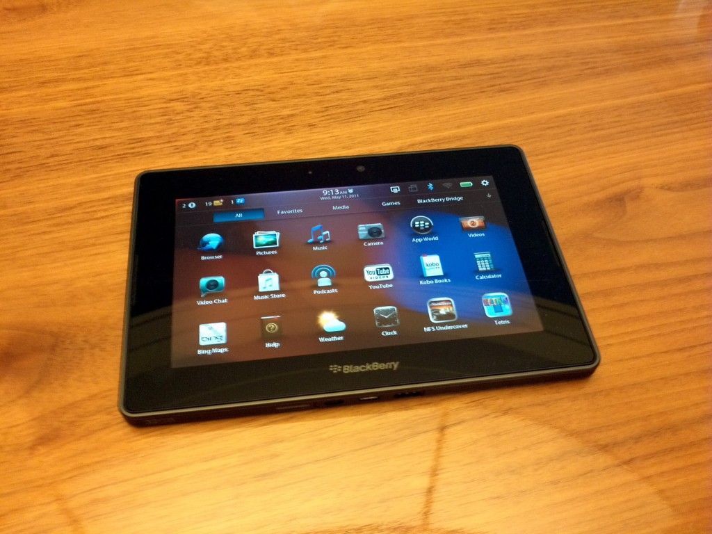
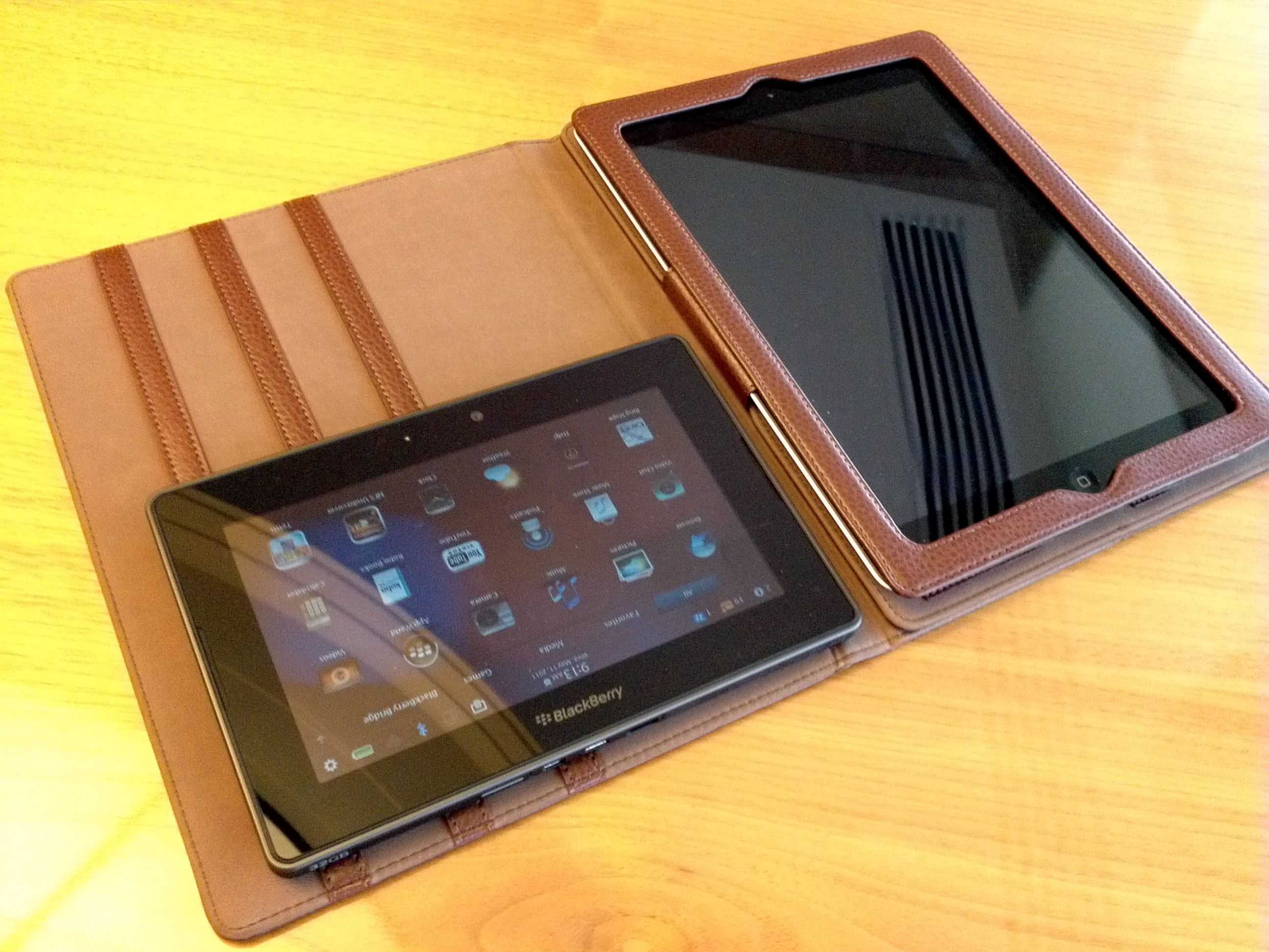
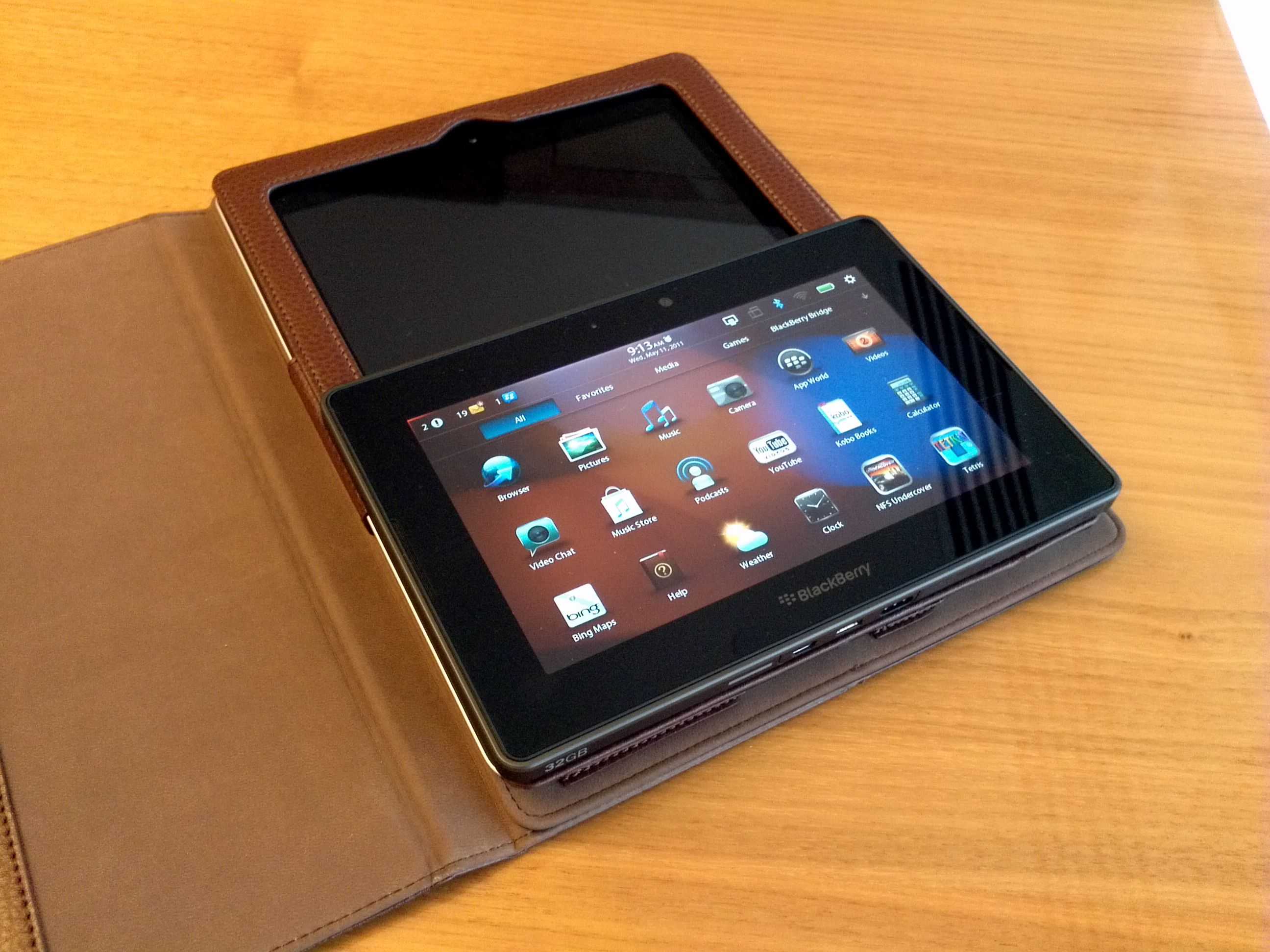
I managed to get a few hours hands on with the Blackberry Playbook [tracking page] today. First impression out of the box was: Wow, it’s tiny.
Laptopmag has done a comprehensive review of the device and they are pretty much on the money with their assessment. I didn’t experience any of the software issues they had though except for the slowness to rotate the screen when I turned the device.
The form factor is very similar to the Samsung Galaxy Tab and as you can see in the picture it’s roughly half the size of the ipad 2.
I actually found the square design refreshing and it definitely looked and felt different to the other rounded edge tablets. The unit felt solid and well built. The PlayBook has a soft-touch almost rubberised back and this gives a nice grippy surface to hold onto. It was easy to hold in one hand and light enough to do so for an extended period of time. The Playbook measures 7.6 x 5.1 x 0.4 inches, and is thinner than the Samsung Galaxy Tab but is slightly heavier.
It has a 7 inch display but interestingly the bezel forms part of the touch sensitive surface of the screen and allows gestures that make the tablet do things. For example you can swipe up from the bottom of the screen to return to the home screen. The gestures were easy to learn and remember, and I picked them up and was using them naturally very quickly.
There’s a 3-megpaixel camera above the screen, along with a notification LED. There’s also a 5-megapixel camera on the back and the quality from both was very good. Two small slots on each side of the display are the speakers and they were surprisingly good in the quiet room.
The top of the PlayBook has a power button and volume controls with a Play/Pause button as well – a neat feature for media. A headphone jack is on the top right.
The device also has a micro-USB port which allows connection to a PC as a hard drive for file sharing. This worked as advertised and almost made up for the lack of a full sized USB port. As long as you have the cable it will be pretty easy to get files onto the device. A micro-HDMI (D-port), and charging contacts for an optional charging dock (no extra ports on the dock) are located on the bottom edge. The unit will charge from the supplied adapter or via USB when plugged into a computer.
Output from the HDMI was good and allowed full HDMI mirroring as well as presenting mode which meant you could be sending an image, slideshow or video to an external monitor while using the tablet for other tasks.
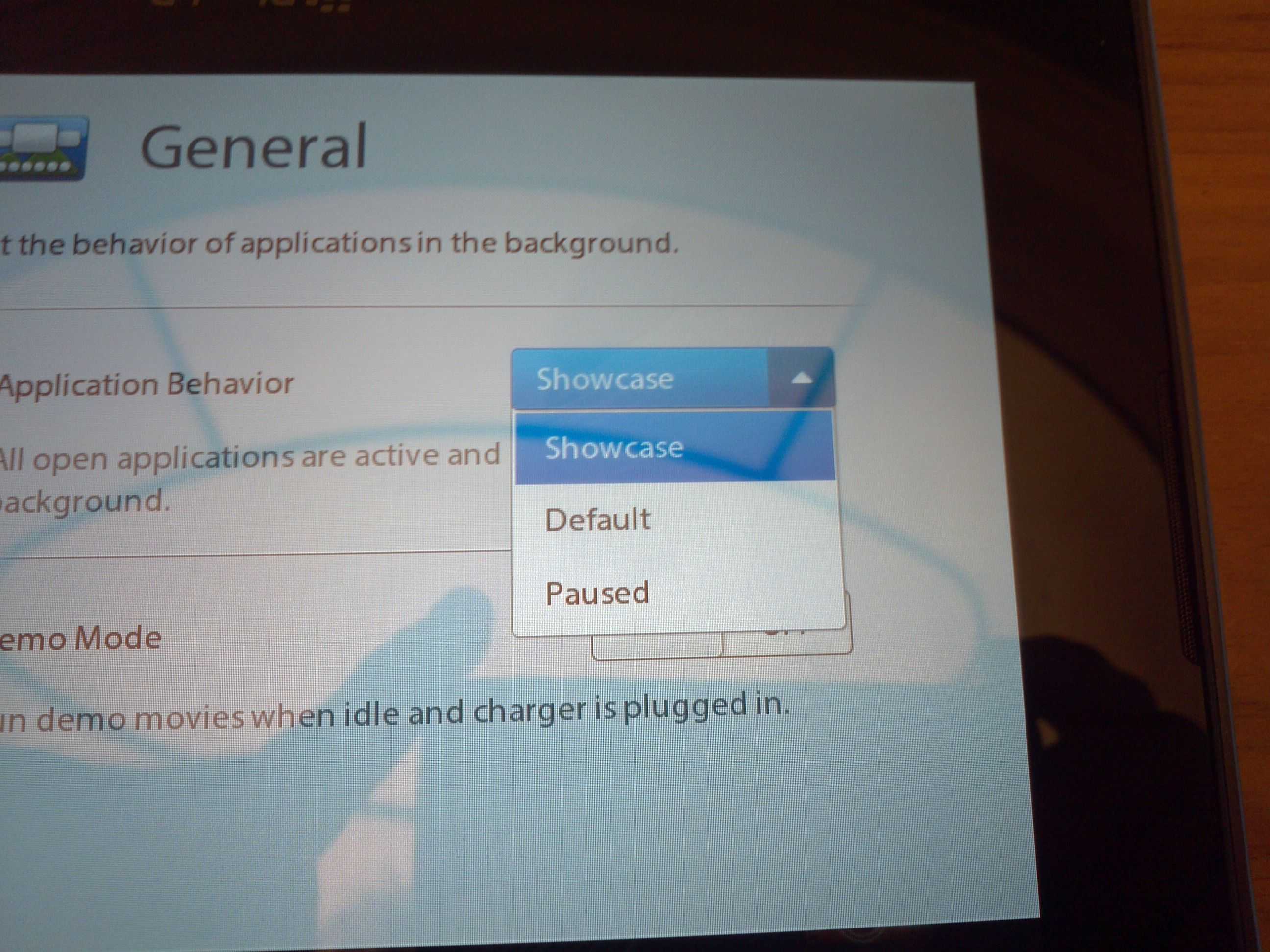
An interesting option in the settings was for the power management. This affected the multi-tasking capability. The options are Showcase, Default and Paused. On the homescreen if you swiped to switch between apps the running apps became smaller windows. Each app continues to run in these windows demonstrating that the OS is multi-tasking these apps and switching between them was ast and smooth. In the showcase power setting the apps still operated in the windows and this was demonstrated by showing a video still playing in the smaller window and while flicking the app selector left and right. This is obviously the most power hungry setting. In Default mode the setting employs smarter power management and in paused mode every app pauses it’s behaviour automatically when you navigate to another app.
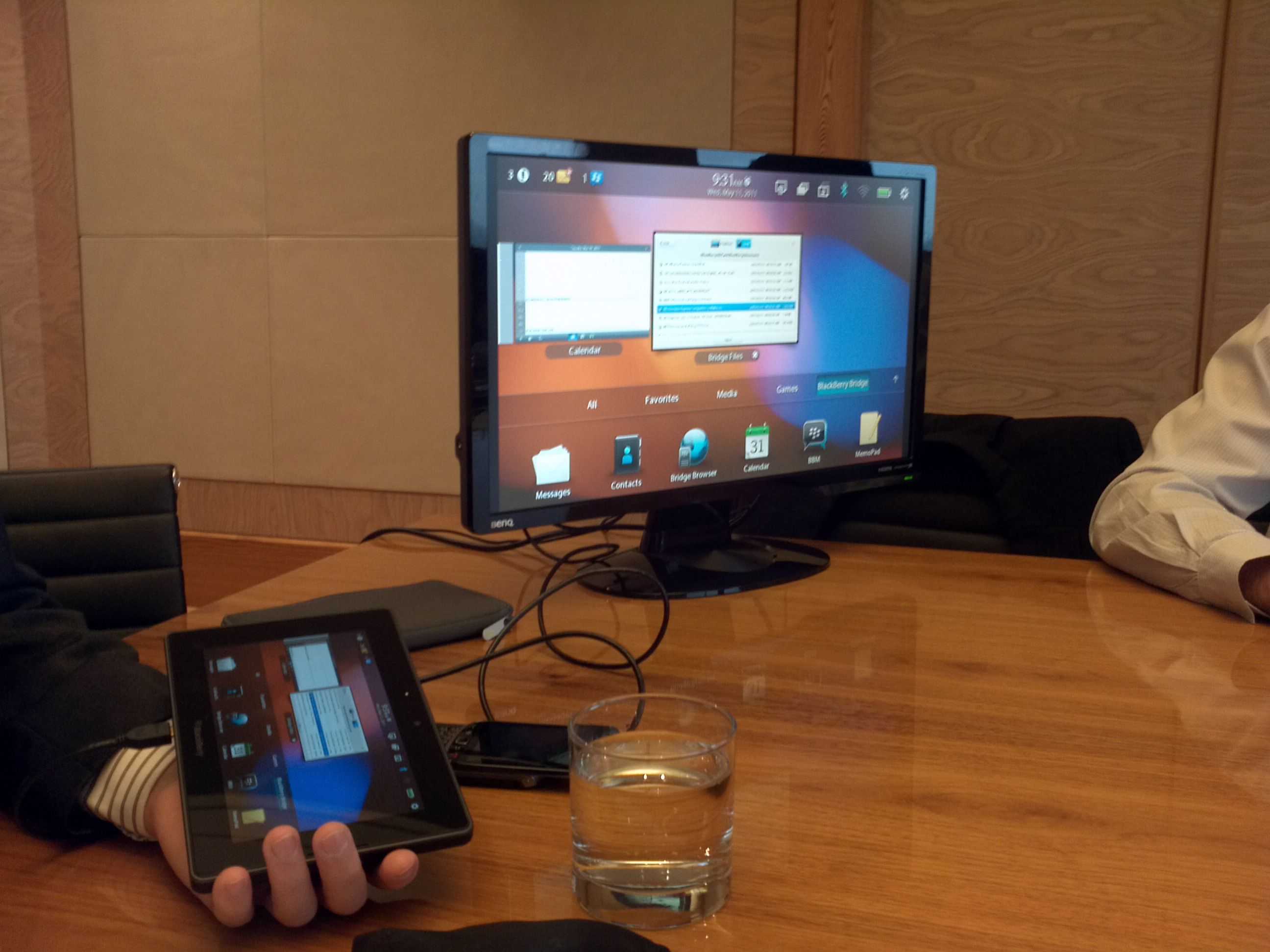
Connecting to the Blackberry phone was simple and I tested out the Blackberry Bridge function as well as 3G tethering. The Playbook is WiFi-only and therefore doesn’t have a 3G capability without tethering to your Blackberry phone. Using the browser over a 3G tether was slow and even with a good 3G signal it then had to travel over Bluetooth which may be the bottleneck. Accessing email, files, and calendar functions over the bridge connection was easy but when opening larger files I really felt the slowness as it could take 20-30 seconds to open a 3MB PDF. I think I would use the bridge connection for email as having a larger screen and big on screen keyboard is much better than the small phone screen but for reading larger word documents or PDF files I would have to download them before attempting to read as otherwise it was just painful waiting for the pages to render.
The RIM sales represtative also mentioned that they will definitely be releasing a 10 inch version within months and hinted at some special features on it but refused to reveal what. While I prefer the small, pocketable size of a 7 inch device I know guys in my organisation prefer a 10 inch screen so the playbook 7 inch will not get a lot of interest from my co-workers. I feel that RIM has realised this barrier to entry in the enterprise business market and that’s why they are releasing a 10 inch version.
Overall the Tablet was well made, had lots of processing power and felt like a well rounded unit with a good mix of features.
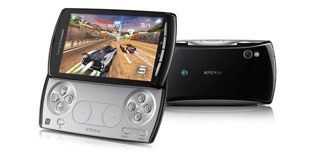
I am certainly not qualified to talk in-depth at the Xperia Play gaming experience but I was certainly quite excited to see the hardware controls and game quality. In the video you hear me talking to a Sony Ericsson representative about the product. We discuss battery life, pricing, availability, get a gaming demo and take a look round the device.
The Xperia play runs Android 2.3 on a Snapdragon 1Ghz CPU (MSM8255with Adreno 205 GPU) with a 4 inch ‘Reality’ display at a true 16:9, 854 x 480 resolution. Note that Android 2.3 brought in some touch responsiveness extensions and enhancements.
What’s important to me is that another major company is now switching to the ARM/Android chassis for another product category which means Android is now in phones, tablets, media players, cameras, gaming devices, TVs and smartbooks. What’s category do you think Google are looking at for it’s next ‘device-specific ‘ branch of Android? Set-top-boxes is something I’ve been keeping an eye on.
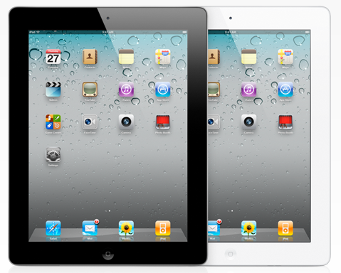
The iPad 2 is here! Are you surprised? Probably not. Apple is quite consistent with it’s product iterations. There’s nothing mind-blowing about the iPad 2, but it’s definitely set the new bar for tablets. Here’s the low-down:
Specs:
iOS 4.3
9.7 inch capacitive glass screen with oleophobic (fingerprint resistant) coating @ 1024 x 768
Dual-core Apple A5 CPU @ 1GHz
Enhanced GPU that Apple claims is 9x faster
16/32/64GB memory options
Forward-facing camera (with FaceTime support, naturally) @ 640×480 resolution
Rear camera for up to 720p (1280×720) video recording
Sensors: Gyroscope, accelerometer, light sensor, digital compass
WiFi a/b/g/n & Bluetooth 2.1
3G & GPS (optional)
25 watt-hour battery
White or black bezel options
Dimensions & Weight (and size comparisons):
The iPad 2 is 9.5 x 7.31 x 0.34 inches or 241.2 x 185.7 x 8.8 mm. That’s right, the iPad 2 is ridiculously thin, probably the thinnest tablet on the market. It’s even more thin than the iPhone 4 (9.3 mm).
Here is the iPad 2’s size visualized against two other 10 inch tablets, and the original iPad:
The iPad 2 is also a bit lighter than the original iPad: 1.33 pounds (601g) vs. 1.5 pounds (680g). Here’s how its weight stacks up to the competition:
Weight was one of my major complaints in my iPad review, so it’s nice to see that they’ve been able to bring it down somewhat. Still, as Chippy noted on twitter earlier, they fell short of the important 1 pound mark.
Design
The design of the iPad 2 isn’t far off from the original, though they’ve reshaped it to make it much more like the latest generation of iPod Touch.
Specifically, they’ve flattened the dome shape on the back of the iPad, but still let the edges taper up to the sides of the device. This eliminates one of the surfaces, so now you’ve essentially got just a front and back with a smooth transition between, rather than individual sides. Keeping the sides rounded means you’ll be able to get your fingers under the device to pick it up, but the overall width of the iPad 2 has been reduced over the original.
Thanks to Apple’s iPad 2 video, we got to see some cool shots of the device’s insides. Check it out below:
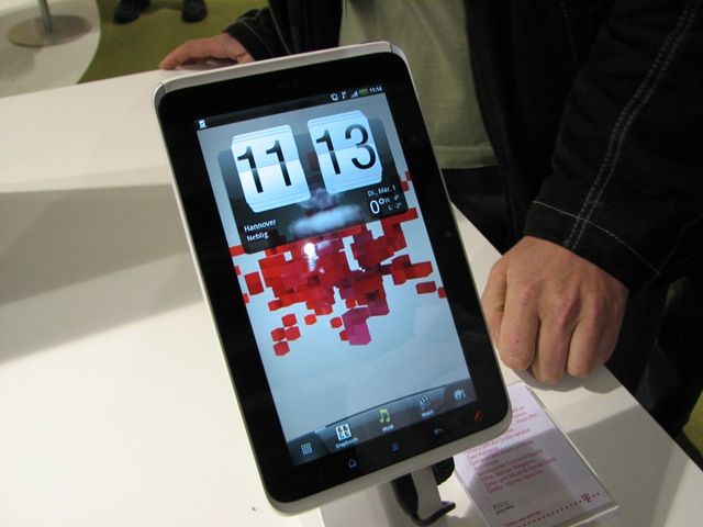
The HTC Flyer is in no fit state to be assessed right now and I wonder why HTC actually bother showing such a critical device in their portfolio at such big events. The pen system doesn’t work, the software is not complete and even the design of the device is changing. I expect to see this sort of activity from, lets say, 2nd-tier ODMs but not someone like HTC.
So what is there to say about the product? It’s got a 1.5Ghz Snapdragon processor (single-core, apologies for the error in the video) and Android 2.4. Google applications are available and it’s a similar size to the Samsung Galaxy Tab.
IF the pen feature works for both handwriting and ‘snipping’ it’s an interesting idea but the pen has no silo and even requires batteries. I can’t see anyone remembering to take the pen with them or even bother to get it out of their bag when needed. There’s no voice, SMS and MMS capability either.
Yes, the processing speed is good. Yes the HTC Sense adds value to many. Yes, the price will drop soon after launch.
Is it enough to tempt people away from the Galaxy Tab which is likely to be half the price in Europe when the HTC Flyer launches in May or June.

 Over at Ritchie’s Room, Ritchie has gotten his hands on a retail version of the much anticipated Asus Eee Pad Slider and has given us a great preview of the sliding Honeycomb tablet.


 The iPad 2 is here! Are you surprised? Probably not. Apple is quite consistent with it’s product iterations. There’s nothing mind-blowing about the iPad 2, but it’s definitely set the new bar for tablets. Here’s the low-down:
 The iPad 2 is 9.5 x 7.31 x 0.34 inches or 241.2 x 185.7 x 8.8 mm. That’s right, the iPad 2 is ridiculously thin, probably the thinnest tablet on the market. It’s even more thin than the iPhone 4 (9.3 mm).


 The design of the iPad 2 isn’t far off from the original, though they’ve reshaped it to make it much more like the latest generation of iPod Touch.

")
")